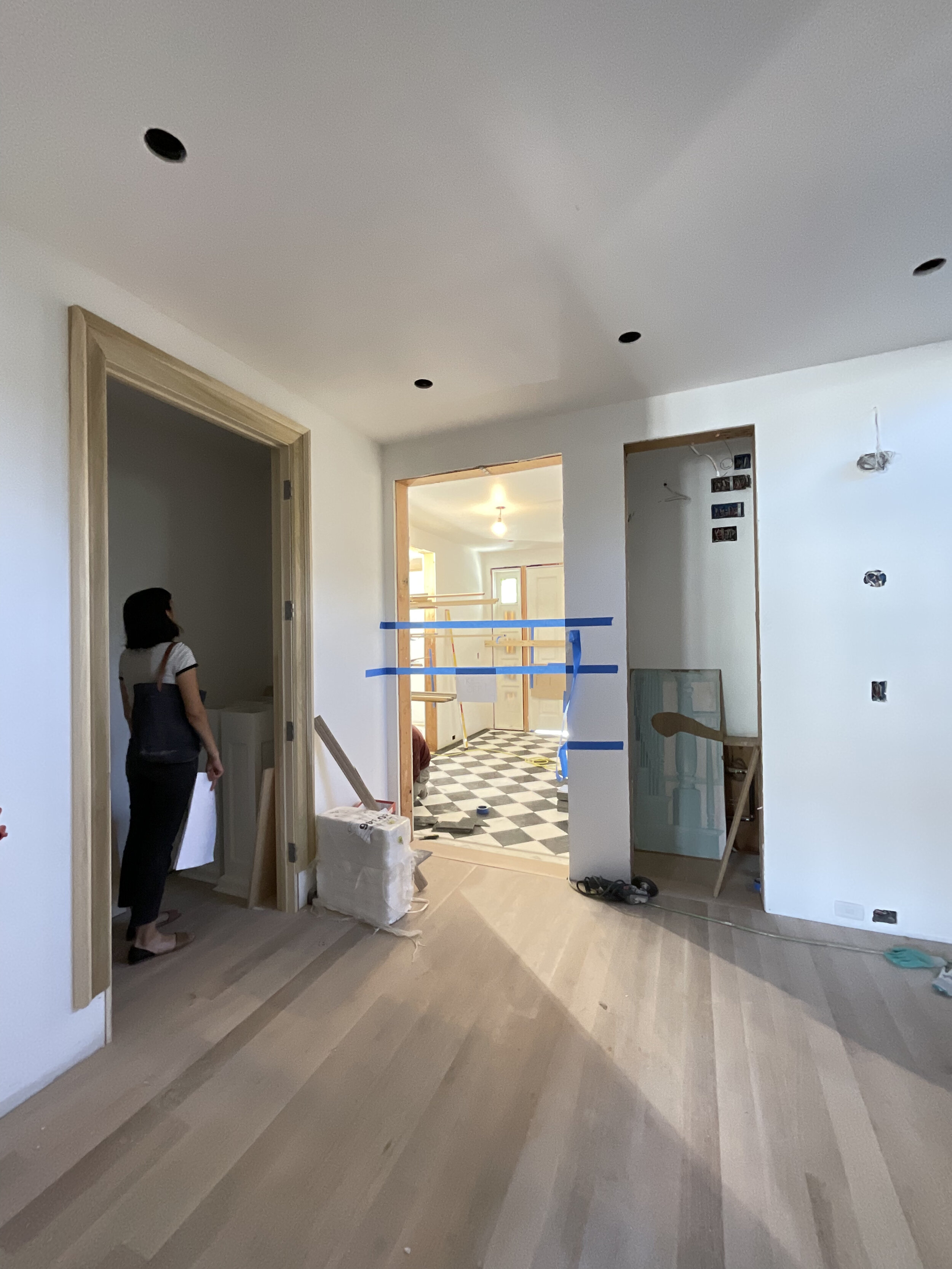
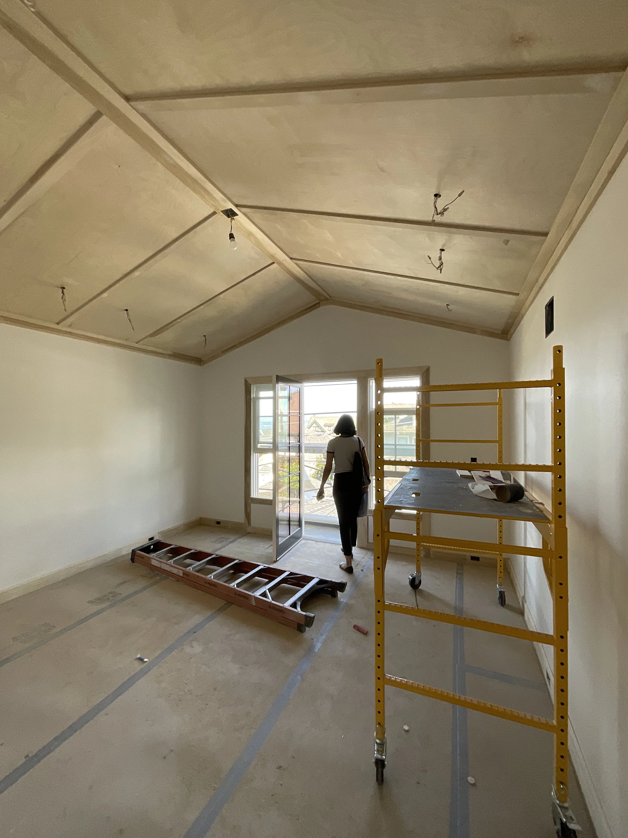
Mt. Baker Install

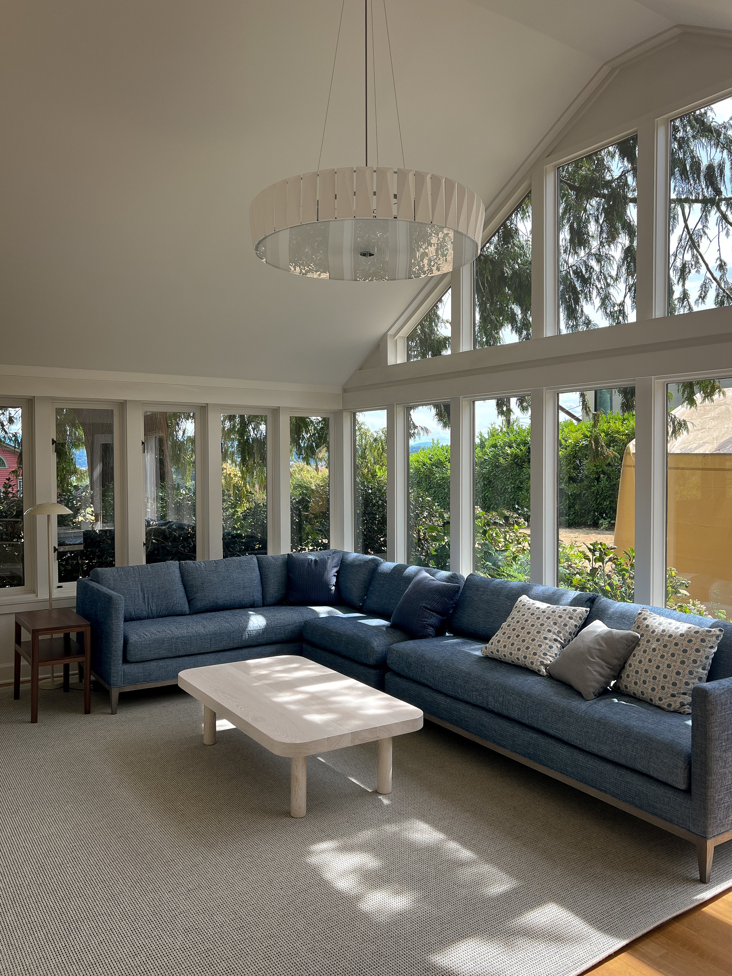
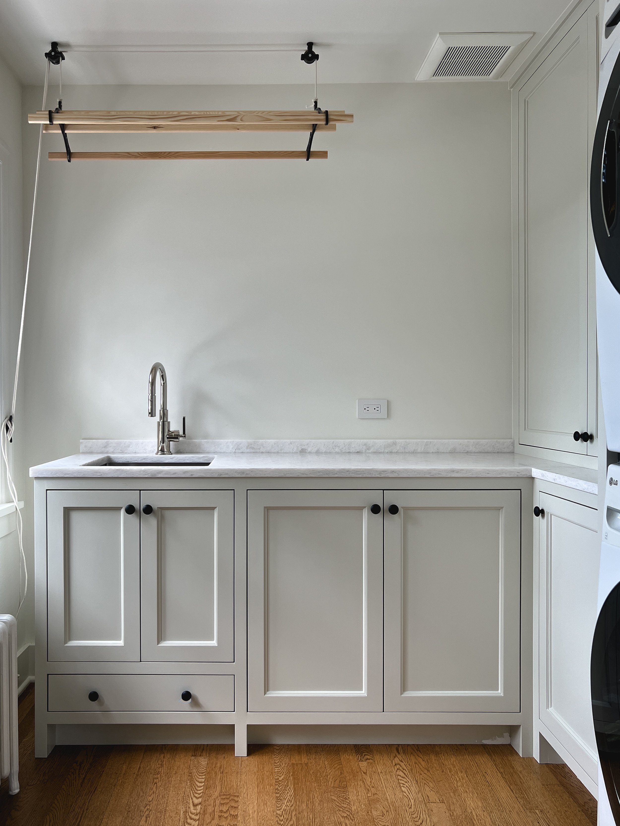
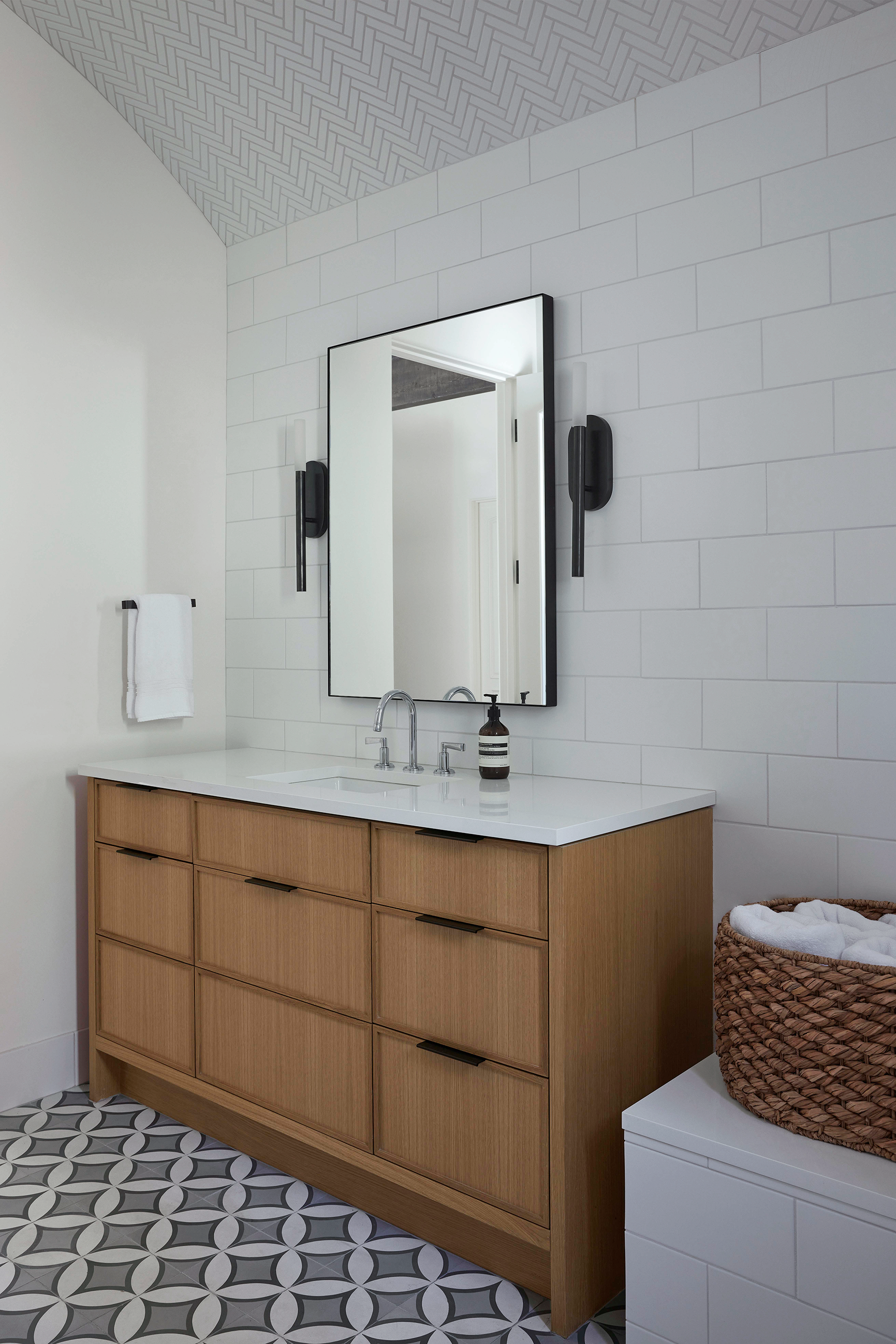
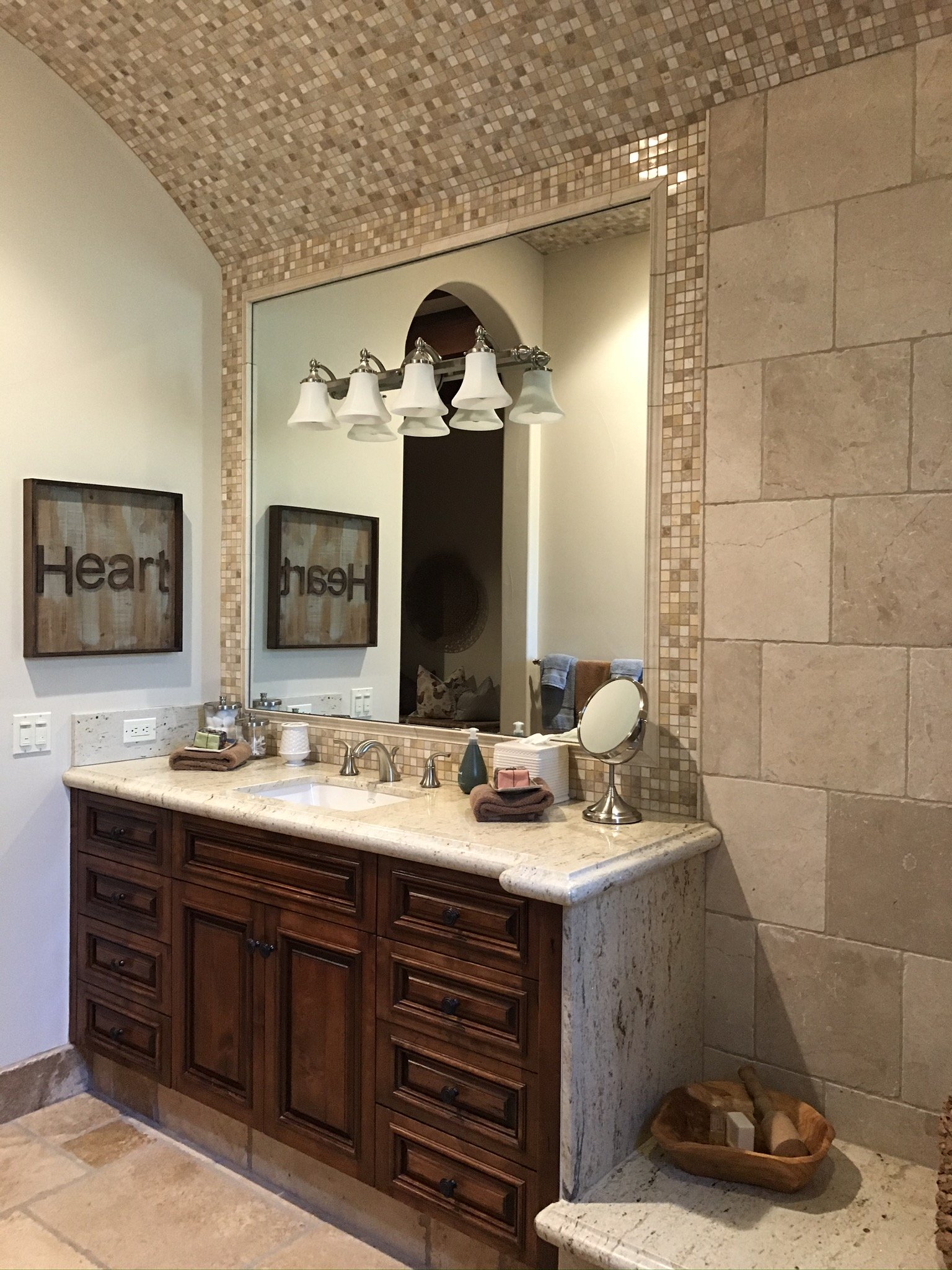
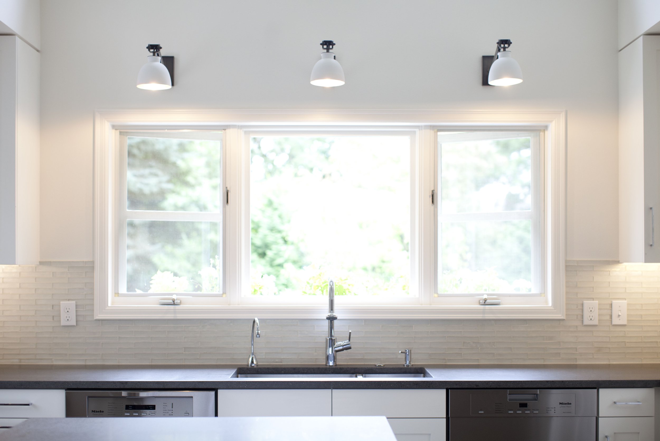
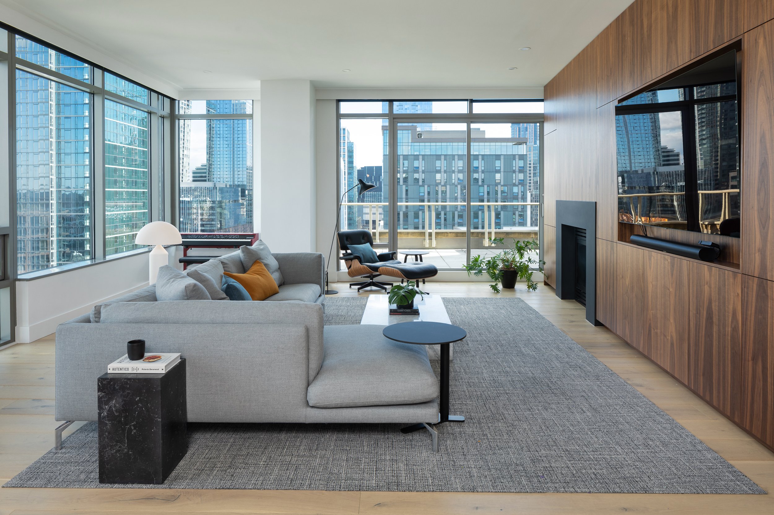
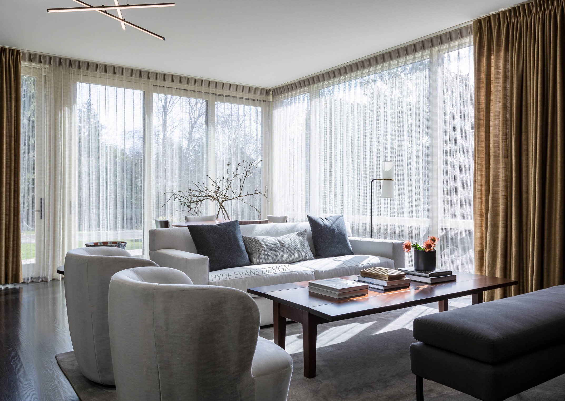
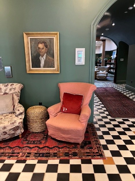
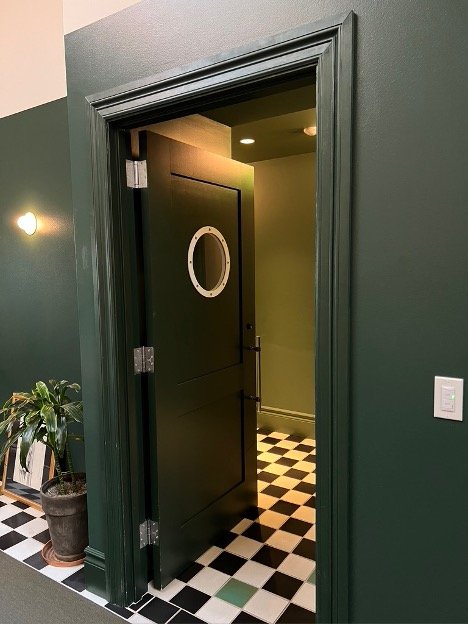
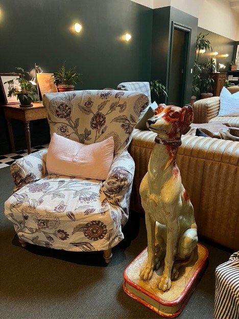
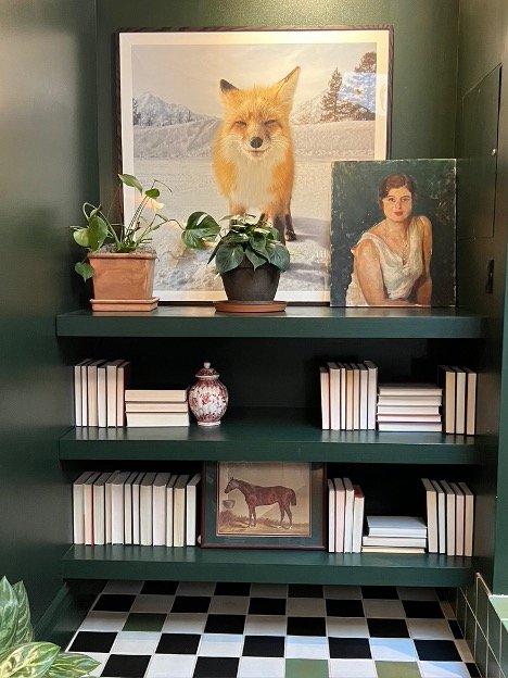
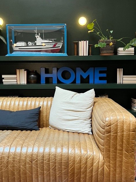
Couldn’t be happier to hand off our Mt. Baker project to its owners/our amazing clients. Thank you for your trust. Also, what a pleasure it was collaborating with the team at Schultz Miller to see this project through.

We have a few finishing touches left. Stay tuned for official project photos early next year. We can’t wait!

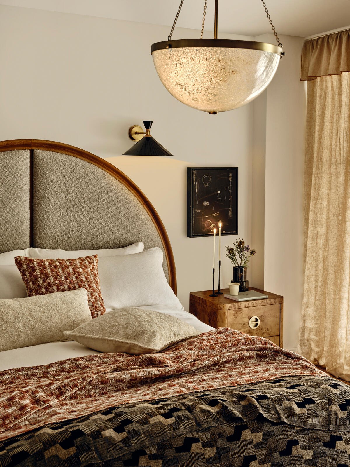
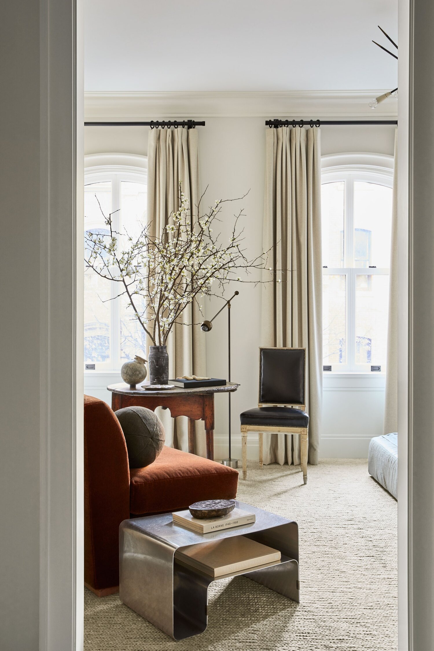
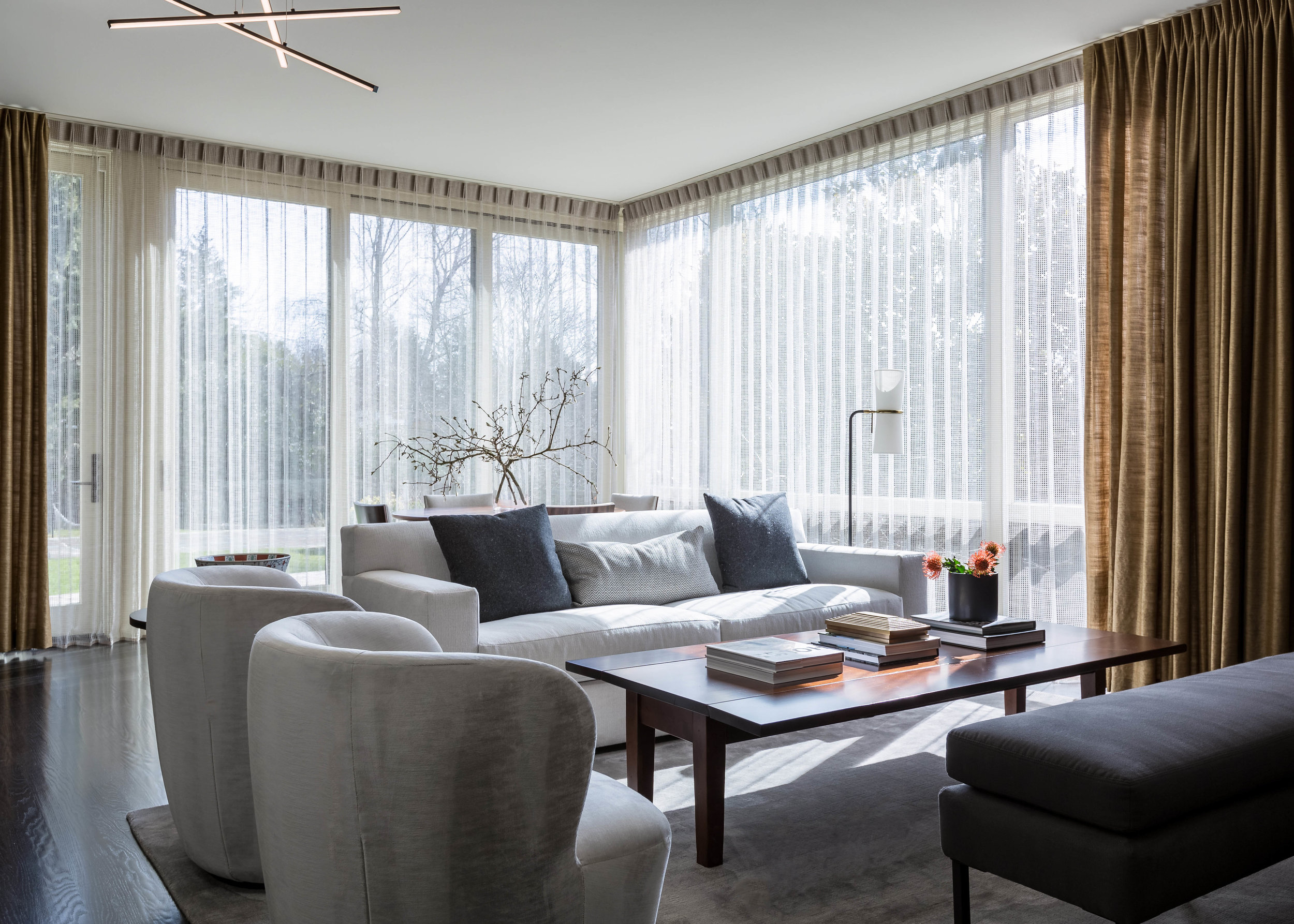
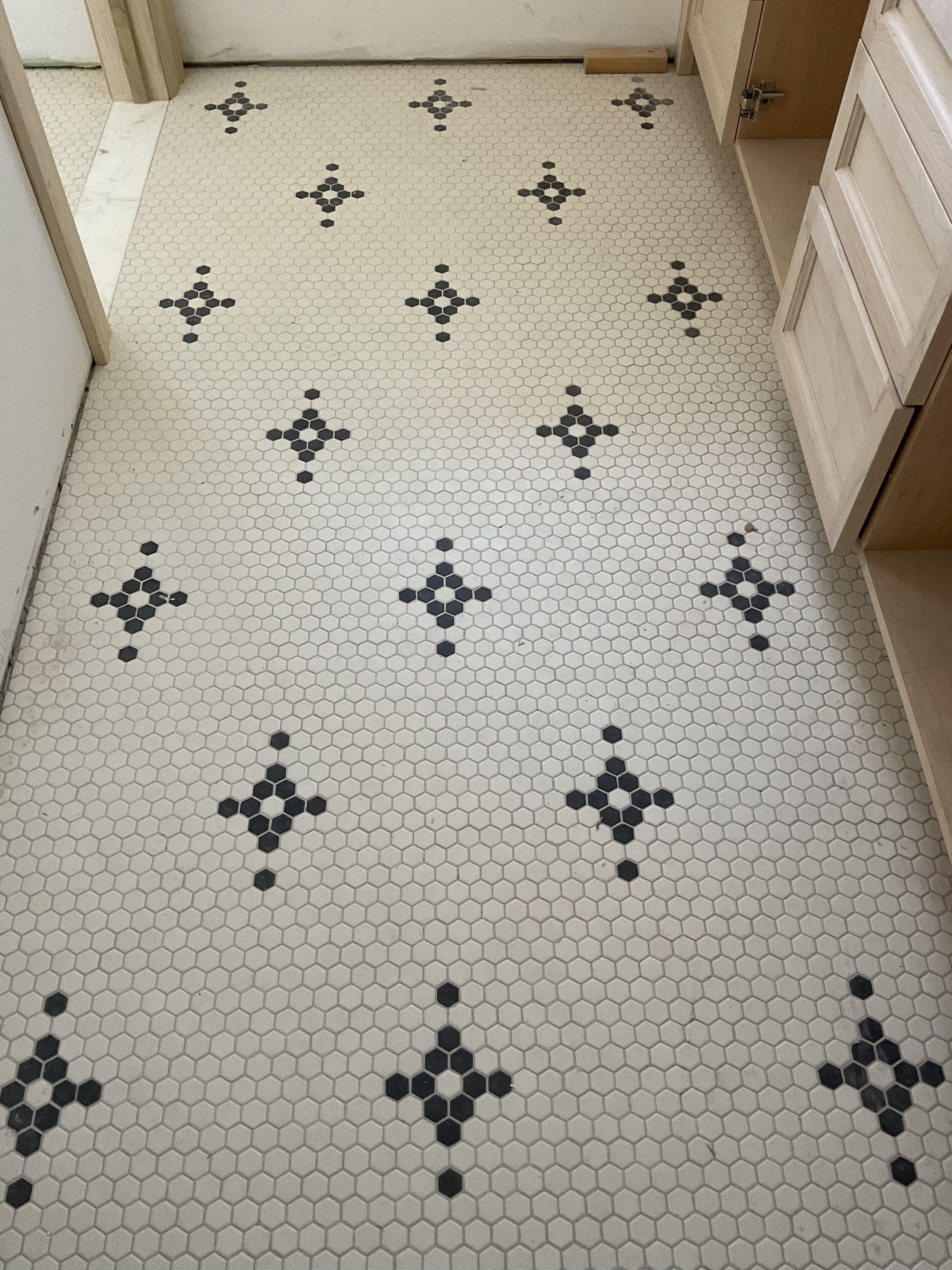
In the meantime, here’s a few of our favorite moments from the install:

Saving on Your Remodel


Remodeling is at an all time high. With daily inquiries to handle kitchen, bath and other remodels, we now have 30 years of experience doing remodels and new construction.  This qualifies us to do remodels not only well, but also cost effectively. We would like to pass along some tips. 

One thing that will drive up the price of a remodel the fastest is something that professionals call "scope creep".  That means adding additional items to the job as you go along.  Planning ahead and really knowing what you want at the beginning of the job will save money.  Adding an area later in the job is far more costly.  For example, bringing in someone to dry wall twice.  Preplanning is very important.  Make all your decisions up front.  Changing your mind or delaying a job because you can't make up your mind can be costly.

Get good help.  The right professionals can make all the difference.  You may pay a little more for their time, but they will save you from expensive mistakes.  Make sure you have checked your builder’s references and reputation.  If you are moving exterior or support walls, work with a reputable architect or hire an interior designer who does interior architecture and has plenty of experience.  

Our clients are almost always surprised at the overwhelming amount of decisions that must be made.  A professional designer knows what decisions need to be made up front and can help you make all the selections before you start. They will work with your builder to make sure they have what they need before they need it, so the job goes quickly and smoothly, which means more money stays in your pocket.  Most importantly, you will avoid ripping out and replacing something because it is not done attractively well the first time. You can imagine what that does to your bottom line.

As I said, remodeling and new construction is at an all time high.  Getting the best help may mean you are waiting in line.  I promise you, it is well worth the wait.

Gallery Walls

A piece of art here and another there is wonderful, but other than an over scaled single piece of art, there is nothing more impactful than an art gallery wall.  Gather your smaller works and group them in a single space and you’ve added amazing texture and interest.  

 Don’t have the art?  You can buy online, but I find it far more fun and memorable to get out there and scour art fairs, small, local galleries, design shops and even flea markets.  

My son, Sam, and I travel together quite a bit.  We always make it part of our trip to check out the local art scene wherever we go.  Our favorite was a trip to Paris where we stumbled upon an Art Fair of mostly silk screened prints. We also had to make purchases with smaller scales in mind to make sure they fit in our bags.  We scored big time at great prices: Art gallery walls for both of us and a great family memory created all in one.


Gallery wall for a project in NY.


 How to make your gallery wall perfect:

 1.    I find that works of varying sizes and a combinations of horizontal, vertical and square, or even round, work best.  But you can certainly create a gallery wall that is very symmetrical with pieces that are all the same size , like a wall of vintage album covers, or you can at least frame works to be the same size.   
 

Project in Capitol Hill featuring a whimsical gallery wall above a custom built banquette.


2.    If you wish to include objects — small wall sculptures or fiber art for example — go for it.  You’ve added even more texture and interest.  
3.    If the grouping looks too busy or haphazard consider matching frames or mats or both.


Studio sketch for an office gallery wall.


4.    We lay the art out in Auto CAD, but you can physically lay it out on the floor before hanging.  Start from the center and build out from there. 


Preliminary elevation for the banquette gallery at our Capitol Hill project.


5.    Keep spaces between your art consistent to avoid uncomfortable negative space or a distracting tangent when things are too close


6.    Don’t forget small spaces and rooms!  Here’s a story — a friend created a fun to visit powder bath with a collection of vintage clown paintings.  Each painting launched an interesting story about how it was found.  My friend loved to throw dinner parties.  I remember a night when we all crammed into the powder to hear about them.

7.    Consider a theme and make it meaningful to you. You could collect black and white photos, vintage portraits, Retablos, prints, or actual art, all by one artist, works from a specific era like mid Century, botanicals, etc.  


Another whimsical and fun gallery wall at our Capitol Hill project.


Even for a simple and sparsely decorated space, a gallery wall suddenly takes your room from blah to interesting and complete.  It can create not only a stunning focal point but one that is personal, tells your story, and creates an intentional space for remembering and revisiting our warmest memories.

-BHE

10 Common Decorating Mistakes Part 2

Our team is always here to help and we love guiding our clients through their design experience - but we know there are times you want to stand on your own two feet.

Here are some helpful tips to avoid the most common decorating mistakes:

1.     Hanging fixtures at the wrong height. 

Generally speaking, hang smaller fixtures closer to the ceiling and larger fixtures further from the ceiling.


Our Desert Residence remodel featuring Ironware chandeliers


2.     Over or under accessorizing. 

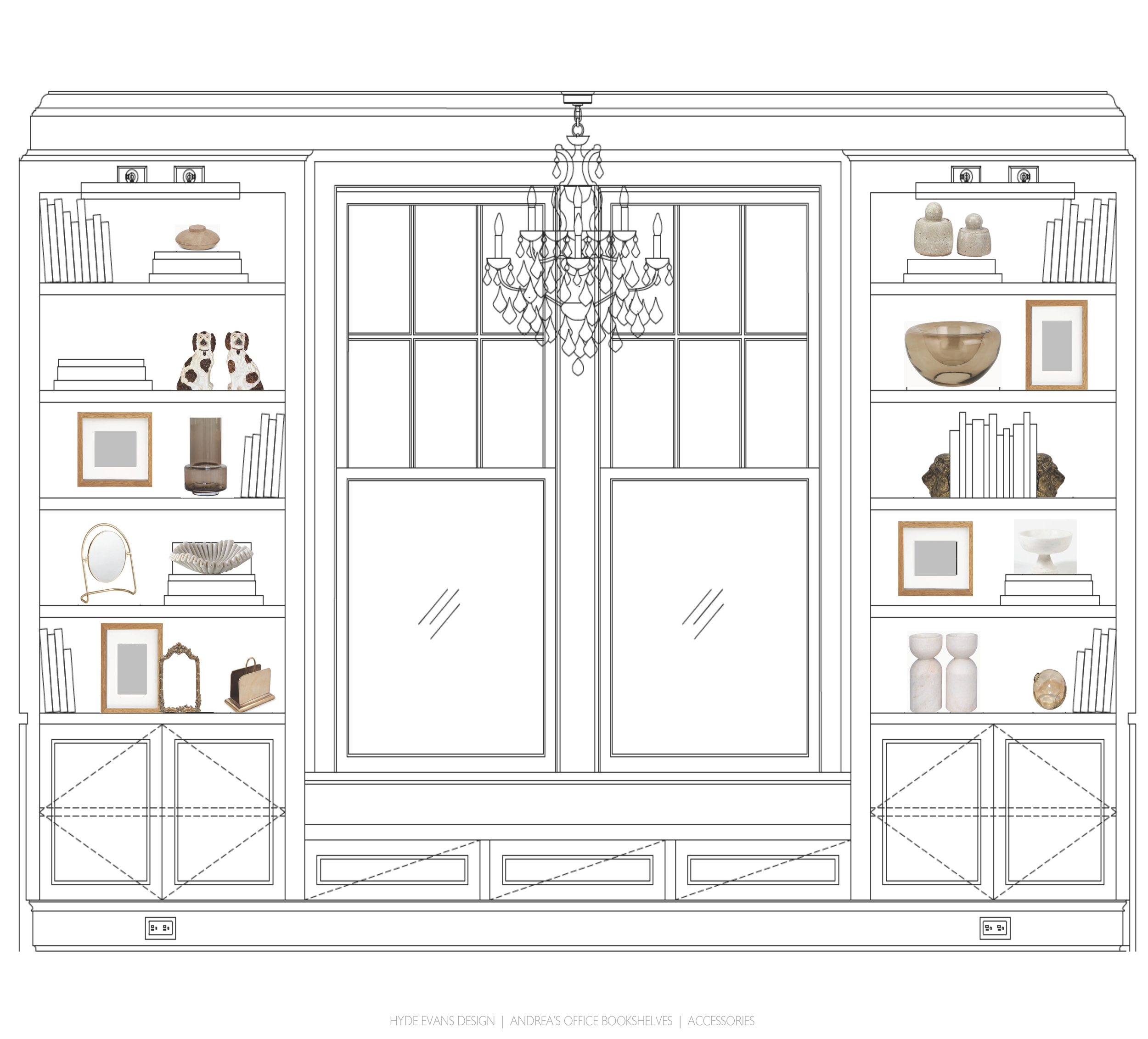
Accessorizing makes your house a home, but planning and intentionality will help you avoid cluttering your space. Keep scale in mind and add a little at a time until it feels just right.  Remember plants and throws for character and texture. Balance is key to avoiding a cluttered shelf.


Concept board for our Capitol Hill project - accessorizing shelves for a truly special office.


3.    Forgetting to consider the temperature of light in your room. 

I’m not only speaking of natural light (although, of course, it is critically important) but the color temperature of your bulbs.  Color temperature can change the color of a fabric or wall color from the showroom floor to your home.  Take a swatch home before loading up the credit card.


White in particular is one to watch for - the Clyde Hill kitchen remodel required many hours of thoughtfulness and color swatching to effectively mix whites in varying shades and textures.


4.     Buying the wrong size area rug.   

Dependent on the size of your room, it is wonderful to have an area rug that grounds all your furniture pieces and defines the focal point of your room.   However, this can be cost-prohibitive and often not possible.  For an alternate solution, make sure to have the front legs of a sofa on the rug and all legs of an accompanying lounge chair.  In a bedroom, the area rug can begin in front of the nightstands and should be 32-36” wider than the bed in total length and width. 


A functional and inviting living room for entertainment, gathering and rest at our South Lake Union remodel.


5.     Lack of textural variety.

I remember early on, walking into a client’s home.  They said there was something wrong with the room, they knew it lacked interest but couldn’t figure out why.  The sofa and all the chairs, even the pillows, were covered in plush chenille.  We reupholstered a chair in tweed and added a leather ottoman.  We changed all the pillows to silky fabrics.  That was it.  The room needed texture.


Textured wallpaper paired with the smooth contrast of natural stone at Desert Residence.


These are just a few tips and tricks we’ve learned throughout the years. Interior design is the gift that keeps giving and we love the challenge. What have you encountered in your design journey?

-BHE

10 Common Decorating Mistakes Part 1

Our team is always here to help and we love guiding our clients through their design experience. But we know there are times you want to stand on your own two feet.

Here are some helpful tips to avoid the most common decorating mistakes:

1.      Not doing a floor plan first.

Before you go furniture shopping do a room floor plan and take it along. Don’t forget to include where outlets are and, obviously, window and openings. Indicate door swings and trims. It will save you from a ton of expensive mistakes. If it’s not something you feel you can handle yourself, have a designer create one for you.

 
Interior design floor plan from a remodel project by Hyde Evans Design

Our Desert Residence remodel required fine attention to detail and many hours determining the best layout for their primary suite. The final result? An inviting and functional bedroom with plenty of designated areas for lounging and relaxation.


  2.     Selecting and painting your walls prior to figuring out fabrics.

Fabrics are limited, but there is an infinite choice of paint colors. Even if you are just doing white, keep in mind that there are ton of shades of white and you don’t want the one you select to be just off.

 
Interior design floor plan from a remodel project in Seattle by Hyde Evans Design

Concept boards for our South Lake Union remodel were so helpful for visualizing color integration.


3.     Purchasing the wrong scale.

Keep the size of your room and the size of the rest of your furniture in mind when you are shopping. A giant sofa with an overly small lounge chair will throw your entire room off balance.

 
Luxury living room in Medina by Hyde Evans Design interior designers

Large living room at our Medina remodel made a perfect home for this sitting area. The selected pieces would seem obtuse in a smaller space however in this living room the scale is perfect resulting in a refined design.


4.     Buying your forever furniture before you determine how you want to live in a space. 

It would be a shame if you bought a dining table that sat 4 and then realized your kids always invite friends. Or, you pick up a small lounge chair and then realize that spot is your favorite reading corner.

 
Family room with large l-shaped sofa by Hyde Evans Design Seattle interior designer

The most comfortable and functional family room for entertainment and gathering at our Lake Washington remodel.


5.     Hanging art too high.

Your art should hang somewhere between sitting and standing eye level.  It should “connect” with the furniture below it.


Custom artwork in perfect balance with surrounding furniture pieces at Desert Residence.


These are just a few tips and tricks we’ve learned throughout the years. Interior design is the gift that keeps giving and we love the challenge. What have you encountered in your design journey?

-BHE

Design Like A Pro

Part 2: Layout and Space Planning

Placing furniture in a living room? Here are some important tips to remember.

Don’t bare the back of your sofa. You never want to walk squarely into the back of a sofa. Use a console table, 75-100% the length of the back of the sofa.  A desk, bench or a side table with chairs on either side also work.  

Do consider how many people you wish to seat in your living room.  If you need seating at a maximum, add an ottoman in front of the fireplace or at the end of a coffee table or leave enough room to bring in a couple dining chairs when needed.

Don’t forget the importance of reading spots.  If possible, give every seating position a light source and a place to put a beverage and/or a book.  

Local Places We Love: Palihotel Seattle

Stopped into “The Hart and The Hunter” Restaurant in Downtown Seattle for lunch the other day. But, my real mission was to take a peek at the hotel it is in.  I had heard the design was charming and I just had to see it. 


Photo credit Jakob Layman/Palihotel


Exterior; Photo credit Palihotel


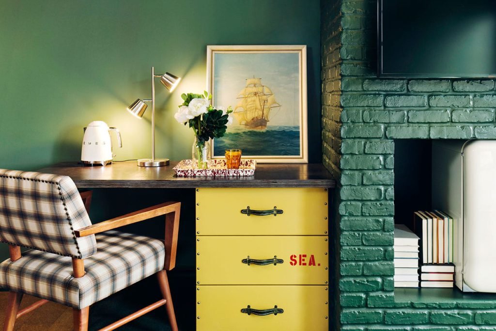
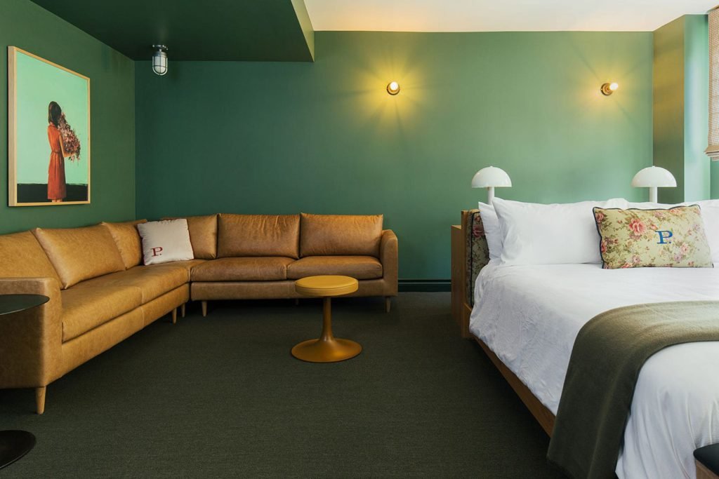
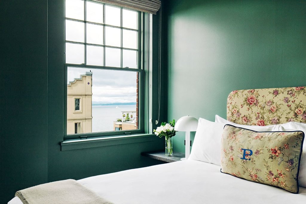
The Palihotel is a boutique hotel across the street from Pike Place Market and every bit charming as promised. The lobby of the hotel is unapologetically homey and eclectic — painted a wonderful (and Seattle appropriate) shade of emerald green. The decision to paint the ceilings was an excellent decision. The result is a cozy and welcoming environment that invites you to relax and take a seat. The lobby is filled with vintage ephemera - books, luggage, rugs and portraits. 


Lobby; Photo credit Palihotel


The mismatched lounge chairs are covered in mixed vintage chintz and the sofas in channeled patinaed leather.  Plants in terracotta pots are strewn throughout as well as a mish mash of eccentric accessories.  A life size plaster hound greets you when you walk into the arched doorway of the lobby lounge. 


Photo credit Palihotel


The hotel is worth a peak, or better yet, a stay. The charm doesn’t stop in the lobby, photos from Palihotel’s website show rooms equally full of character and warm invitation.


Added bonus: the prices I was quoted were very reasonable. Who needs a pre-spring staycation?

-BHE

Source: https://www.palisociety.com/hotels/seattle

Biggest Interior Design Trends for 2023

2023 will bring a big shift to residential interior design and some of the most pivotal changes we have seen in years. So get ready, here they come.  

Warmth.  Yep, it’s back.  Warm neutrals will be taking the lead. Cream, brown and every shade in-between.  


The return of antiques.  Antique accents are back, so bring out great grandmas beloved chest of drawers.  But don’t overdo it. An accent here and there can add just enough personality while allowing the overall look of the room to stay modern.

Wall color.  You’ll see more of it.  Color will be overtaking the white walls that we have seen for several years.  But be consistent.  It is never “in” to do a different color in every room.


Wallpaper.  Along with wall color, a return to wallpaper.  Bedrooms, powders and at home offices are perfect spots.  

Patterns.  Solids have been everywhere but now it’s time to mix in the patterns.  The casual look of mixed patterns will warm up any home.


Raw textures and materials.  Lime wash and plasters are back adding beautiful texture to your home. Wood cabinets in the kitchen will be taking over for white.  Stone walls and fireplaces added to interiors will be big in the coming year.  And adding plants to a room is even more important than ever.  

It’s a lot of big changes for all of us, but it doesn’t have to break the bank. Wallpaper the powder, paint a room or two and add some warm neutral pillows and there you are, you’re right on trend. 

Design Like A Pro

Part 1: Layout and Space Planning

There are a multitude of rules and guidelines in which we spend years learning. We are sharing some of the most important do’s and don’ts here.

Don’t buy furniture without knowing where it will go or how it will fit in a room. This might seem obvious, but we run into this issue time and time again when working with prospective clients. A piece of furniture is completely out of scale, or worse yet, they couldn’t get it through the front door. Interior designers have a distinct advantage when designing rooms and selecting furniture. We create furniture floor plans to scale. Generating a floor plan is an important first step in deciding what pieces (and sizes) work in a space. You can create one by hand or reach out to a designer to do it for you. 

Do move furniture away from the walls if you can. If the space allows, create a central grouping that is conducive to conversation and not cavernous in the center. Highlighting architectural features, which often means the fireplace is also important. Center furniture on either side and don’t block the view to the feature.

Do remember flow. Leave walking paths of at least 36”. The room will feel more welcoming and larger. This is even more important in a dining room where 36” is the absolute minimum for people to be able to get in or out of their seat. If you really don’t have the space, consider banquette seating, it can be a real space saver.


Top Colors This Season

Our Top Colors This Season...


Cool colors have ruled in interiors for the last several years. Cool greys and every shade of blue were everywhere.

But change is in the air. Gold, rust, orange, burgundy, and tobacco are the colors to be watching for in the coming years. Even whites are warming up and greys mixing with yellow undertones.


Don’t worry if you overdid the blue — warm the blue sofa up with rusty-colored throw pillows or an ivory throw. Repaint the cool grey walls with a linen shade.

Cozy up to the idea and enjoy the warmth of it all.


Accessorizing Your Coffee Table

The coffee table is the centerpiece of a living or family room. How you accessorize it is critical.

Decorate a coffee table the way a designer decorates a room. Using texture, color, contrast and scale are all important when considering accessories. Items that contrast with the surface of the table add interest. A light-colored table looks far more interesting with dark items and vice versa. Mixing smooth items such a glass vase, with a rustic box provides visual interest. And vary the height and scale of the objects. Candlesticks, a vase of flowers, branches or, one of our favorites, a white orchid are great options for taller accents.

Books are always wonderful. You can make a few stacks or just use a couple. Scale the books to the size of the table and stack them to any size that looks right. And make the subject matter of each personal and important to you. Show off who you are. It’s your home.

If you have several smaller items you want to display, consider a tray to arrange those items so that you create an interesting collection. Spreading them out can make the table look disorganized and messy.

Consider a 360 degree POV when placing an item. Leave photo frames for shelves to hide the backsides.

We are big on finding a beautiful box to keep the remote in if there is a TV in the room. Not only does it become a beautiful element on the table it hides a utilitarian element. An antique, a family heirloom, or clean and simple but made of beautiful materials like walnut or Carrara marble could be perfect.

However, creating a menagerie of several items is not for every room. In a room where the scale of the furniture is large and the look is modern and minimalist, consider one statement piece — a sculpture, large plant or beautiful bowl may be all you need.

Progress

There’s nothing like the feeling of satisfaction in watching months of design planning and meetings become a reality. While we are far from finished results, we are still so excited to see our project in Capitol Hill come to life!

Kitchen cabinet installation

Cabinets going up in the kitchen with design plan renderings to show the eventual paint division as well as our materials palette.

Kitchen design planning rendering
Kitchen materials palette, featuring color swatches, appliances, light fixtures, etc.

We also took a peek at one of our guest baths featuring a custom tile design by lead designer, Benni Adams.

Bathroom black and white floor tile design by designer Benni Adams
Bathroom remodel showcasing white shower tile and black and white floor tile
Bathroom black and white floor tile design by designer Benni Adams
Bathroom design planning rendering, showcasing the floor tile layout
Bathroom design plan rendering and materials palette

Other points of interest - there are few things better than the drama of high ceilings and black and white tile.

Home entryway under construction, showcasing the back and white checkered flooring
Home interior under renovation
Interior staircases under renovation
Top floor/attic under renovation

Thank you for following along - come back soon for more updates!

Palettes

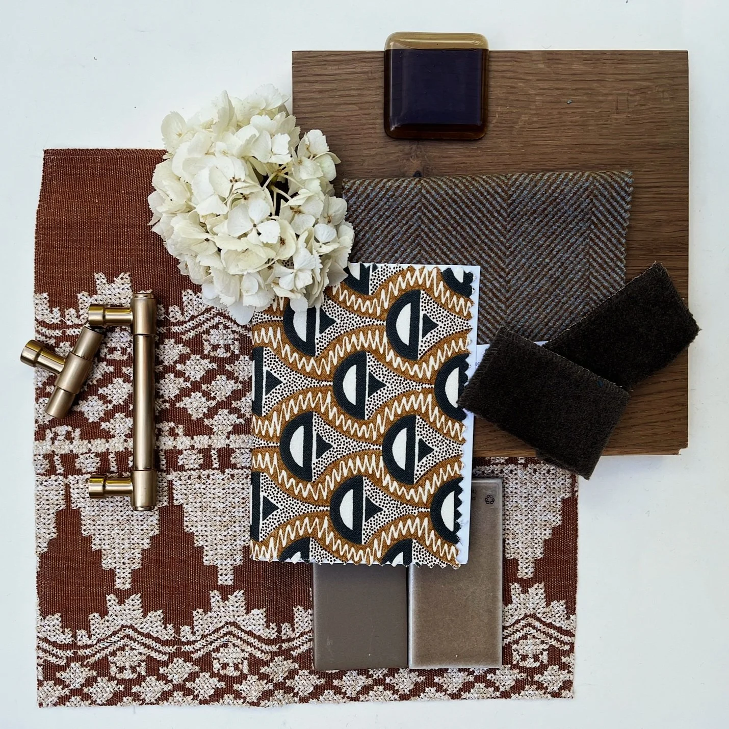
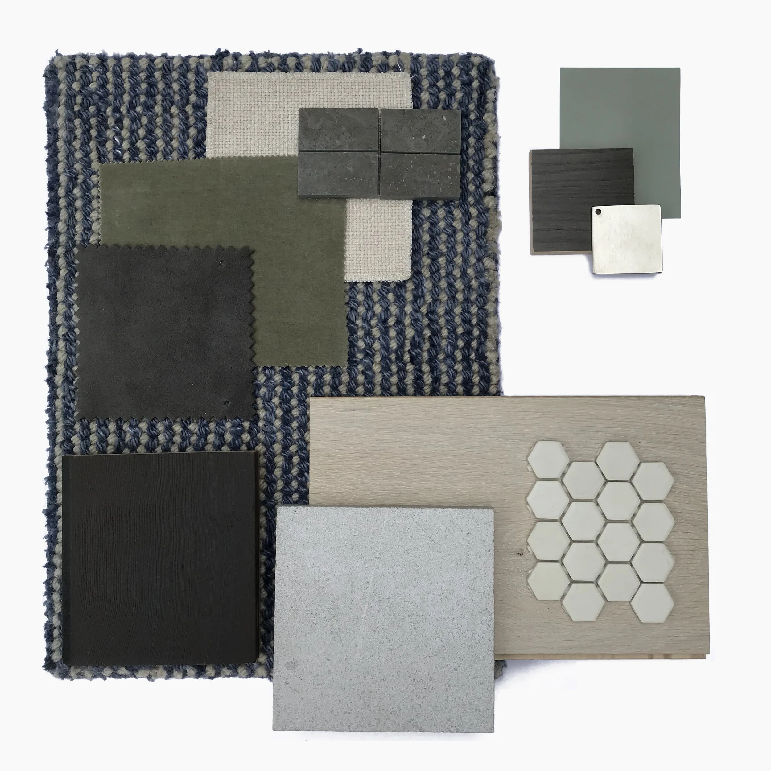
Successfully mixing materials within a space - from soft fabrics to stone - is a true art form. Many hours are spent finding materials and ordering samples for comparison to assemble the perfect palette for our clients’ projects. When done thoughtfully and intentionally, the final result should feel and look effortless as all the materials work together in perfect harmony.

For our Lake Forest clients, it was important to keep selections light, bright and airy while incorporating the natural tones of the surrounding mountains and woodland. Take note of rich jewel tones for contrast and grounding throughout the home.

Neutral color palette consisting of different materials
Grey, pink and brown color palette consisting of different materials
Dark & mid-tone color palette consisting of different materials

We Are Growing!

HED is happy and incredibly fortunate to announce that we have been expanding! This week, help us in welcoming our newest team members.

Photo of Mae Schlenker

Mae Schlenker

Junior Designer

  • Where are you from? Olympia, WA

  • Why interior design? Growing up, the Sims was a lot of fun. It was the first thing I played that made me wish I could do more! Ever since I could pick up a marker, I've always been interested in creative activities. I've loved drawing, writing, and making up spaces and stories in my head - I still draw from time to time and my love for design is not going anywhere.

  • What inspires your work the most? I love 3D art and natural forms - when designing, I want to find a way to create a unique space that feels natural and functional at the same time. Growing up around nature has influenced me heavily, and watching the city and landscape change over time makes me ask: What will this design feel like years from now?

  • When you’re not working, what are you doing? I love going on walks, hikes, and exploring new trails and campsites I've never visited. I also enjoy drawing, working out, and playing games - I still enjoy the Sims from the time to time.

Photo of Adaiah Flores

Adaiah Flores

Junior Designer

  • Where are you from? El Paso, TX

  • Why interior design? I remember watching “Trading Spaces” in the early 2000’s where teams worked with a carpenter and an interior designer to redesign their neighbors’ houses. Shows like this made me ask, “Is interior design really a career?!” Turns out it is with so much more than what they showed on TV. During my interior design program, I began to see that I leaned towards the technical side of design. I loved learning about materials and thinking through how something is built as well as functional space planning and programming.

  • What inspires your work the most? Natural materials, architecture, and travel. I visited Tokyo in 2019 and found charm in the details as I walked around the city - from the tiled exterior of buildings to the small footprints and minimal design aesthetics of the various coffee shops and restaurants. There was so much to see and appreciate yet it was done in such a meaningful and effortless way.

  • When you’re not working, what are you doing? Going on adventures with/training my Australian cattle dog, cooking, spending time in nature and exploring new places.

Photo of Maxine Kao

Maxine Kao

Project Assistant

  • Where are you from? Atlanta, GA

  • Why interior design? I feel like it started with episodes of This Old House coupled with watching my dad build and remodel spaces in our home growing up. Since then, I’ve always been drawn to interior design – I find it fascinating on every level.

  • When you’re not working, what are you doing? Going to Lagree classes, hunting down good fiction novels, and more recently, shopping for and decorating my studio apartment! It’s a small space so stretching my creativity to get the most out of my floor plan has been a fun challenge. It also doesn’t hurt that I work in an office full of designers who graciously point me in the right direction.

How Do We Flow?

Taking a closer look at our Coachella Valley project – a great example of how we can utilize shape, material and color to establish flow between separate spaces in one home.


A Note On Flow From Barbara Hyde Evans:

If you have ever been in a home where every room had a very different color scheme and/or every room had a decidedly different style then you would notice it can be quite jarring to walk through. The energy of the home might feel unsettled and hard to relax in. This is why we talk about flow - it is an essential element of good design that helps an environment to feel settled, peaceful and confident. It should reflect your style and what makes you feel the most at home.

You have heard about "flow" in referring to a homes interior: you want your home to have good flow from outside to in, you want good flow between rooms, etc. Let us help you understand what it is and some ways you might accomplish it.

And take note, good flow is not seen but felt - it does not mean every room looks the same.

Mid-century in Coachella Valley

Beginning in the bedroom of our Coachella Valley project, a vibrant teal accent wall is featured with cool blue accents, walnut furnishings and distinctly mid-century radial shapes characterize the space.

Mid- century bedroom design with cool blue accents

While in the dining room, walnut furnishings, a cool white dining table and radial burst chandelier with accents of green and teal echo color, shape and material elements found in the bedroom. The overall effect feels cohesive and dynamic instead of redundant.

Dining room with white dining table, radial burst chandelier and accents of green

Can you spot the distinctive midcentury elements that play across this project’s design? Here in the kitchen, we observe several details that resonate in shape as well as color. Notable bright teal accents liven the space and add youthful dimension.

Midcentury kitchen design with teal accents
Mid-century kitchen design with stainless steel appliances and accents of teal

As a result of the consistent yet subtle use of these special details, the final effect is an environment that feels grounded in its design and clean.

HED Celebrates the AAPI community in Design

HED recognizes the innumerable contributions members of the Asian American and Pacific Islander (AAPI) community have made to the design industry and our team would like to celebrate and remember those contributions.

Here are a few of our favorites:

Isamu Noguchi | https://www.noguchi.org/

Isamu Noguchi is a Japanese American sculptor and multi-hyphenate designer with work ranging in furniture, lighting, theatre and set design as well as numerous sculptural art pieces. His prolific portfolio includes one of the most iconic pieces of modernist furniture today - the Noguchi coffee table produced in collaboration with Herman Miller in 1947.

Photo of Japanese American sculptor Isamu Noguchi sitting at the Noguchi coffee table produced in collaboration with Herman Miller in 1947.
 

Maya Lin | http://www.mayalin.com/

Maya Lin is a Chinese-American, award-winning designer, sculptor, craftsman and architect. She is best known for designing the Vietnam Veterans Memorial in 1980 as a 21-year old undergraduate architecture student.

Maya Lin at the dedication ceremony of the Vietnam Veterans Memorial in 1982.

Maya Lin at the dedication ceremony of the Vietnam Veterans Memorial in 1982. (Photo: The Washington Post/Getty Images)

One of her recent projects - Folding the Chesapeake - is a portrayal of the Chesapeake Bay modeled to scale, using 54,000 marbles with the help of NASA satellite imagery. The marbles reflect light and represent individual components of the ecosystem, while creating a physical guideline to how the waterway has changed over time for the locals familiar with the geography. At its core, the installation is meant to create awareness about the threats affecting Chesapeake Bay: poor water quality, pollution, deforestation, and rising sea levels.

Capturing natural change and creating awareness for conservation, social issues, and historical events is something Maya Lin has invariably taken to heart and is a quality of her work that continues to inspire us daily.

Maya Lin, Folding the Chesapeake, 2015, fiberglass marbles.

Maya Lin, Folding the Chesapeake, 2015, fiberglass marbles, Smithsonian American Art Museum, Gift of Debbie Frank Petersen, 2016.26, © 2015, Maya Lin


Jiun Ho | http://jiunho.com/

Originally from Malaysia, Jiun Ho arrived in the United States in the early 1990’s to study interior design and architecture. At the age of 26, he launched his own design company. Since then, he has grown his interior design business to include original furniture, lighting, and textile designs featured in premier showrooms across the US, Canada and internationally. HED celebrates his industrious and worldly perspective and rich, natural designs.

Interior designer Jiun Ho
Gorgeous Ulu table by Jiun Ho in HED’s Mercer Island project

Gorgeous Ulu table by Jiun Ho in HED’s Mercer Island project

A Final Message

Our team at HED sends our condolences to the families affected by the escalation of violence against Asian Americans - to say we are troubled and saddened by the recent tragedies is an understatement.

If you are seeking ways to support, the following organizations are doing great work for the AAPI community and we encourage you to follow their page and/or donate:

HED Designer Approved White Paint Colors

While white walls may be a classic choice, picking the perfect white is no easy task. After comparing countless swatches, deciphering the difference between white and ivory, and ultimately questioning what even is white- it can be easy to become overwhelmed by a seemingly simple design decision.

Our HED designers are here to alleviate that stress by sharing their favorite white paint colors. 

All White

By, Farrow and Ball

All White color swatch by Farrow and Ball

“All White is an incredibly versatile white, complementary to multiple styles and applications. The brightness of All White works great in small scale applications to help create a sense of openness (think your tiny 300SF NY apartment) while also being a contender for large scale spaces with walls and surfaces that act as a backdrop for bustling activity. It’s a bright and cheery white that will lift your spirits,” HED Senior Designer, Mike Lee said.


Seashell

By, Benjamin Moore

Seashell color swatch by Benjamin Moore

“Seashell is a beautiful creamy white, without an obvious yellow cast. Closer to a bone white, not as dark as ivory. It’s perfect for a more traditional home- it looks like a handsome aged white,” HED Principal, Barbara Hyde Evans said.


Greek Villa

By, Sherwin Williams

Greek Villa color swatch by Sherwin Williams

“Greek Villa is the perfect cozy off-white. Not yellow, not grey, but maybe just the slightest hint of tan. The chip may appear to have a ton of color to it, but spread it out on the wall and it’s very subtle,” HED Principal, Barbara Hyde Evans said.


Preview the HED Shop

For additional details and product information visit out SHOP tab.

Z5 Black Bamboo Cotton Cover Pendant Light by AY Illuminate. Two available. Contact via phone, email, or DM for shipping estimates + purchase inquiries.

Custom plush button-tufted upholstered headboard. Contact via phone, email, or DM for further information and ordering. 

Vintage refractive waffle pattered glass and brushed nickel fittings, holophane shades. 5 units available. Contact via phone, email, or DM for shipping estimates and proceeding with payments.