Our team is always here to help and we love guiding our clients through their design experience - but we know there are times you want to stand on your own two feet.
Here are some helpful tips to avoid the most common decorating mistakes:
1. Hanging fixtures at the wrong height.
Generally speaking, hang smaller fixtures closer to the ceiling and larger fixtures further from the ceiling.
2. Over or under accessorizing.
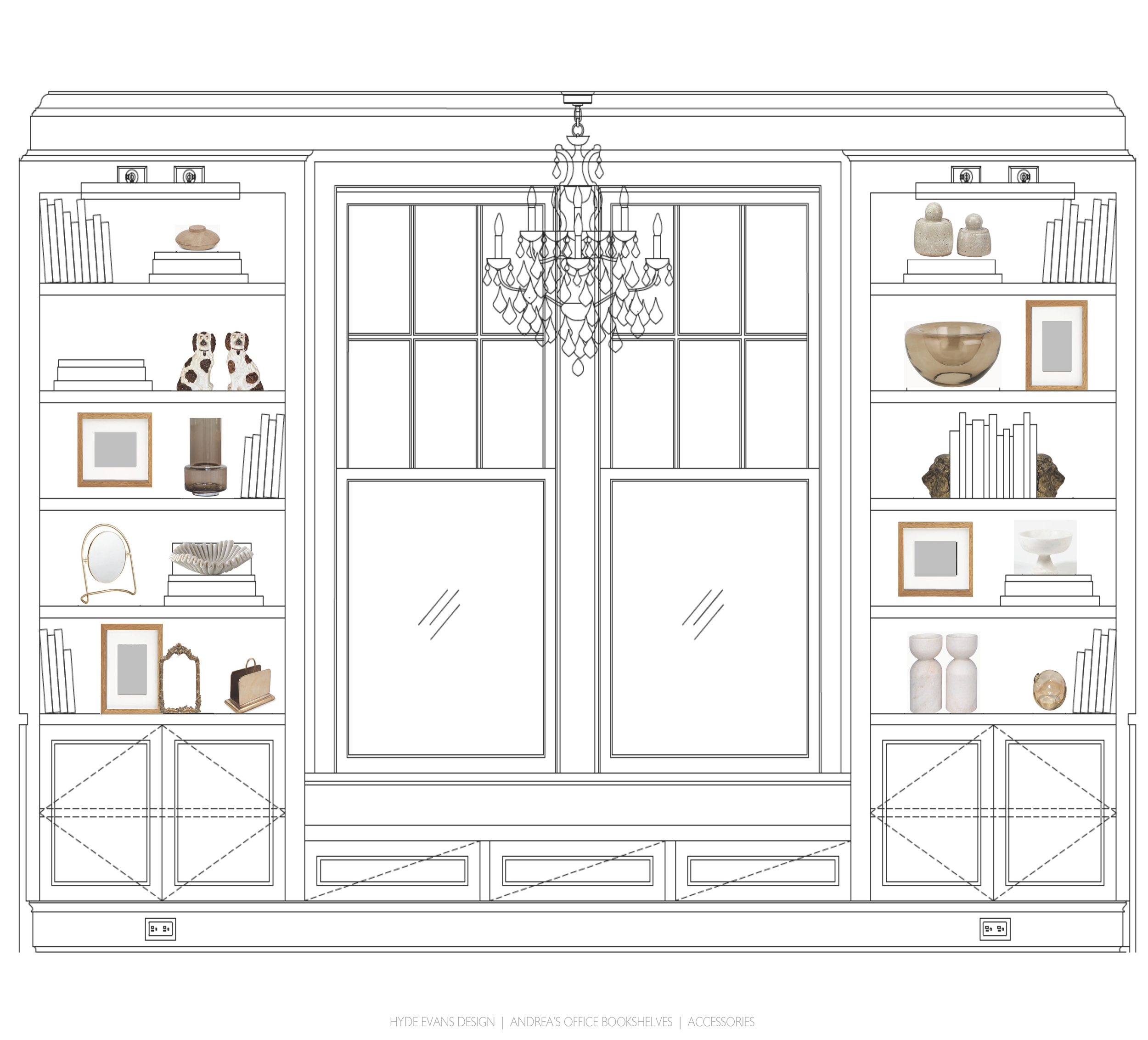
Accessorizing makes your house a home, but planning and intentionality will help you avoid cluttering your space. Keep scale in mind and add a little at a time until it feels just right. Remember plants and throws for character and texture. Balance is key to avoiding a cluttered shelf.
Concept board for our Capitol Hill project - accessorizing shelves for a truly special office.
3. Forgetting to consider the temperature of light in your room.
I’m not only speaking of natural light (although, of course, it is critically important) but the color temperature of your bulbs. Color temperature can change the color of a fabric or wall color from the showroom floor to your home. Take a swatch home before loading up the credit card.
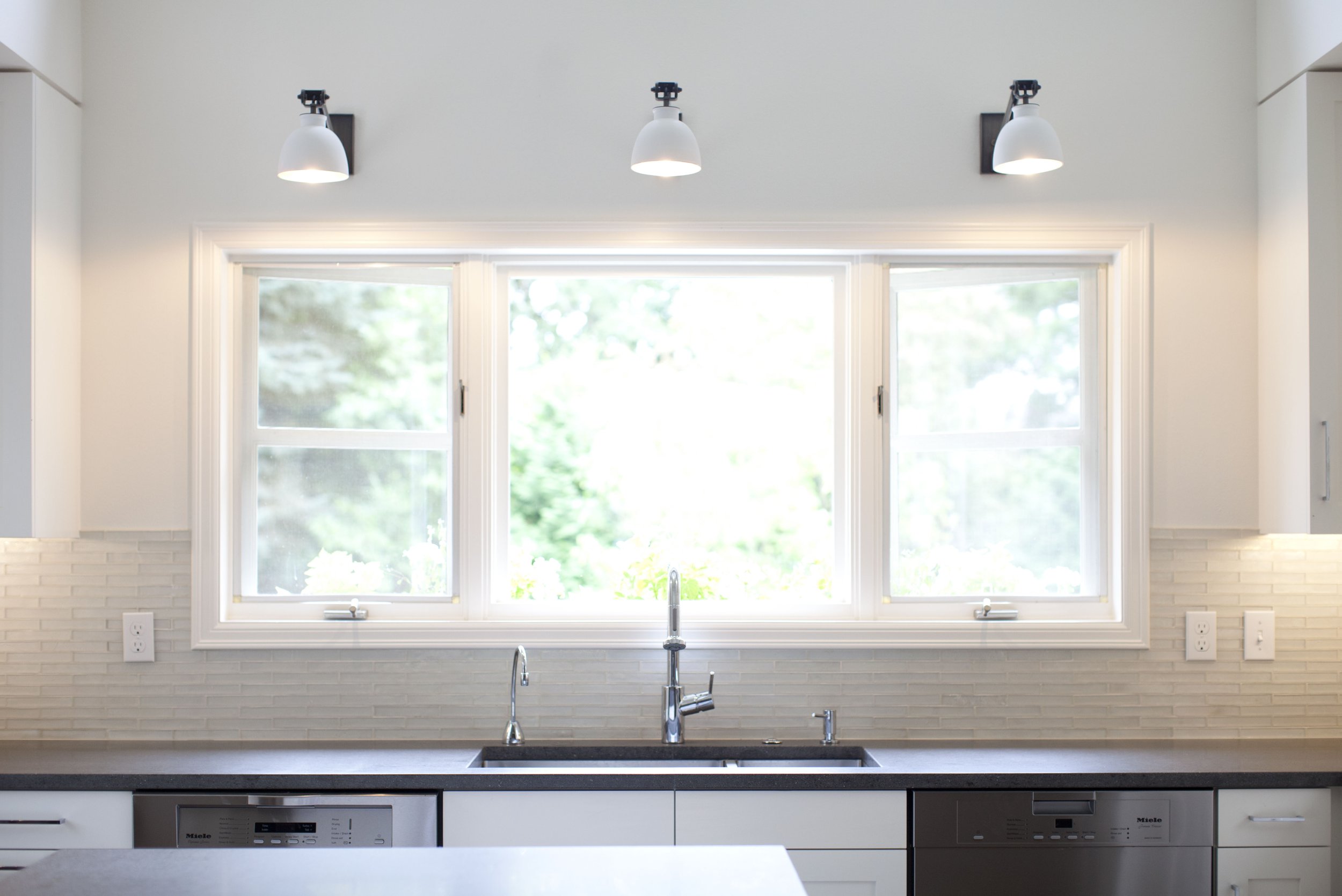
White in particular is one to watch for - the Clyde Hill kitchen remodel required many hours of thoughtfulness and color swatching to effectively mix whites in varying shades and textures.
4. Buying the wrong size area rug.
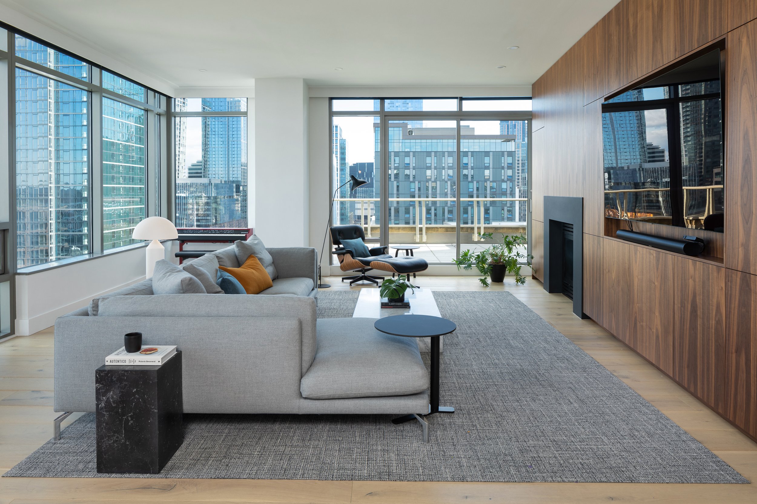
Dependent on the size of your room, it is wonderful to have an area rug that grounds all your furniture pieces and defines the focal point of your room. However, this can be cost-prohibitive and often not possible. For an alternate solution, make sure to have the front legs of a sofa on the rug and all legs of an accompanying lounge chair. In a bedroom, the area rug can begin in front of the nightstands and should be 32-36” wider than the bed in total length and width.
A functional and inviting living room for entertainment, gathering and rest at our South Lake Union remodel.
5. Lack of textural variety.
I remember early on, walking into a client’s home. They said there was something wrong with the room, they knew it lacked interest but couldn’t figure out why. The sofa and all the chairs, even the pillows, were covered in plush chenille. We reupholstered a chair in tweed and added a leather ottoman. We changed all the pillows to silky fabrics. That was it. The room needed texture.
These are just a few tips and tricks we’ve learned throughout the years. Interior design is the gift that keeps giving and we love the challenge. What have you encountered in your design journey?
-BHE


