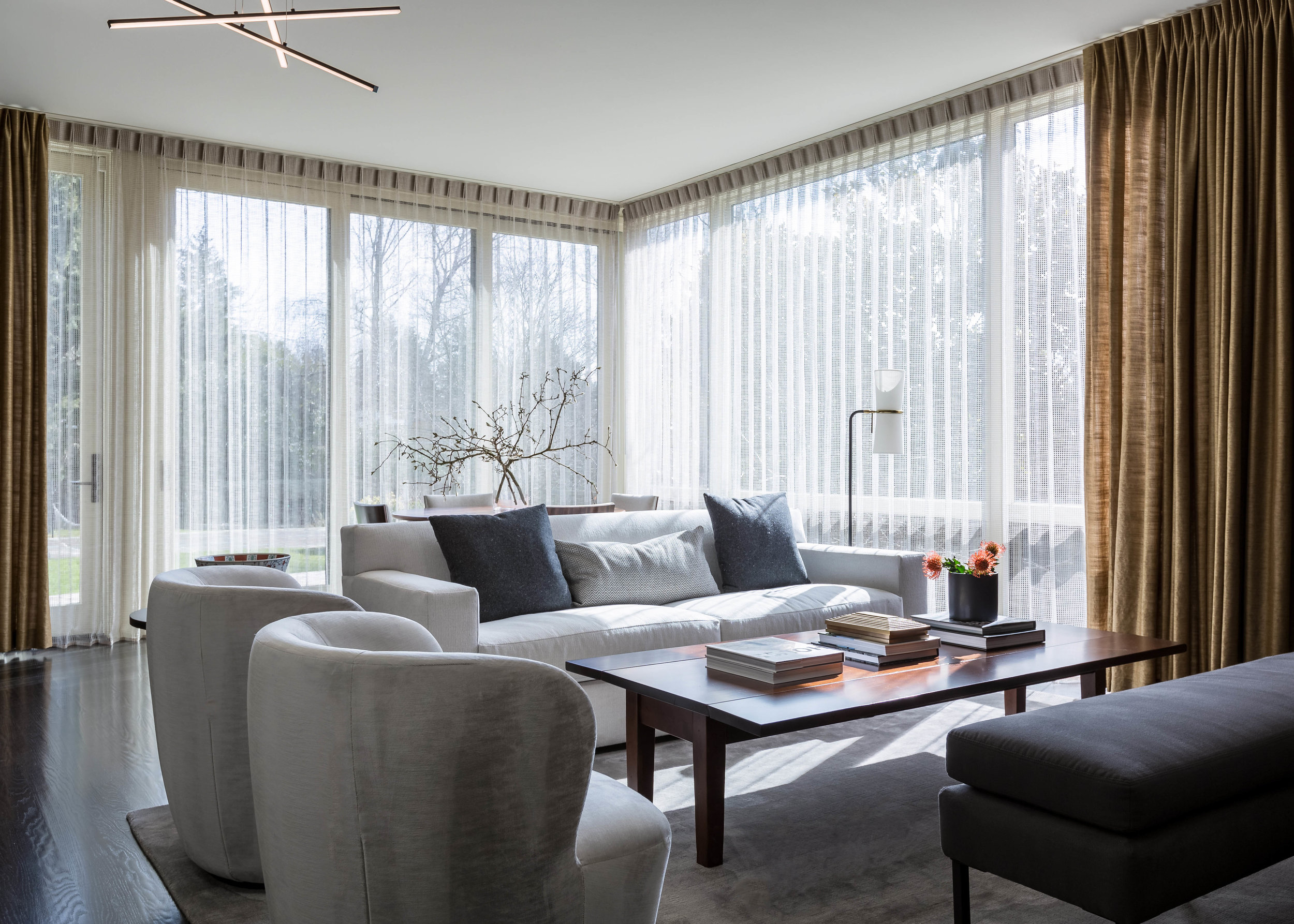
Local Places We Love: Palihotel Seattle

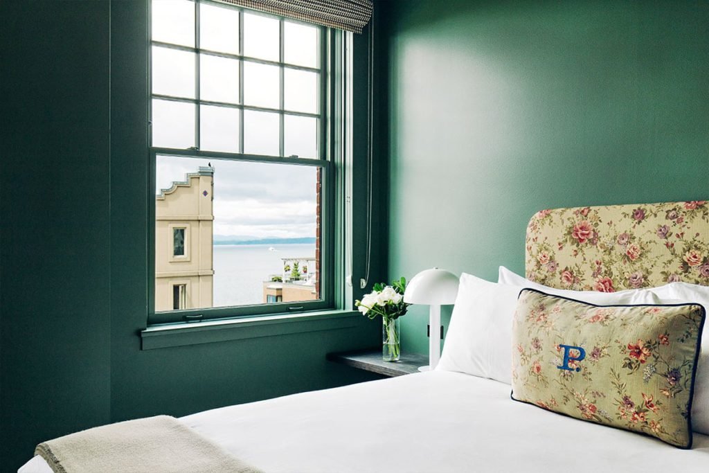
Stopped into “The Hart and The Hunter” Restaurant in Downtown Seattle for lunch the other day. But, my real mission was to take a peek at the hotel it is in.  I had heard the design was charming and I just had to see it. 


Photo credit Jakob Layman/Palihotel


Exterior; Photo credit Palihotel


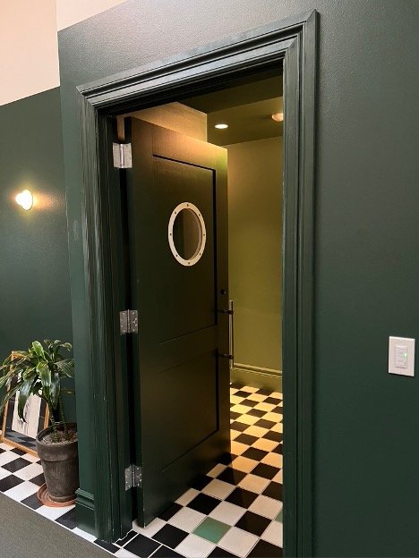
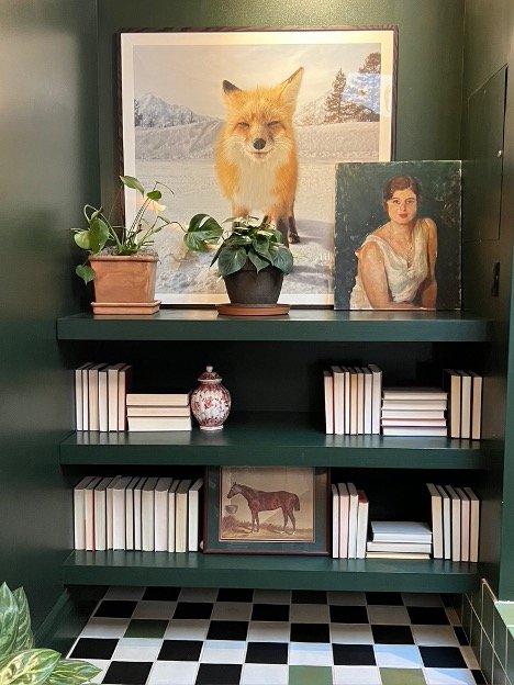
The Palihotel is a boutique hotel across the street from Pike Place Market and every bit charming as promised. The lobby of the hotel is unapologetically homey and eclectic — painted a wonderful (and Seattle appropriate) shade of emerald green. The decision to paint the ceilings was an excellent decision. The result is a cozy and welcoming environment that invites you to relax and take a seat. The lobby is filled with vintage ephemera - books, luggage, rugs and portraits. 


Lobby; Photo credit Palihotel


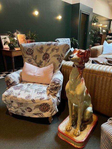
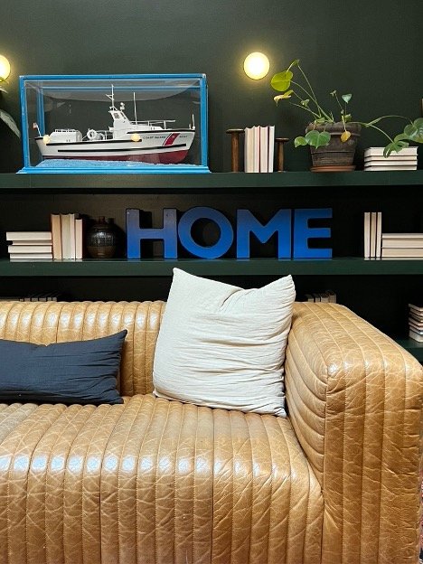
The mismatched lounge chairs are covered in mixed vintage chintz and the sofas in channeled patinaed leather.  Plants in terracotta pots are strewn throughout as well as a mish mash of eccentric accessories.  A life size plaster hound greets you when you walk into the arched doorway of the lobby lounge. 


Photo credit Palihotel
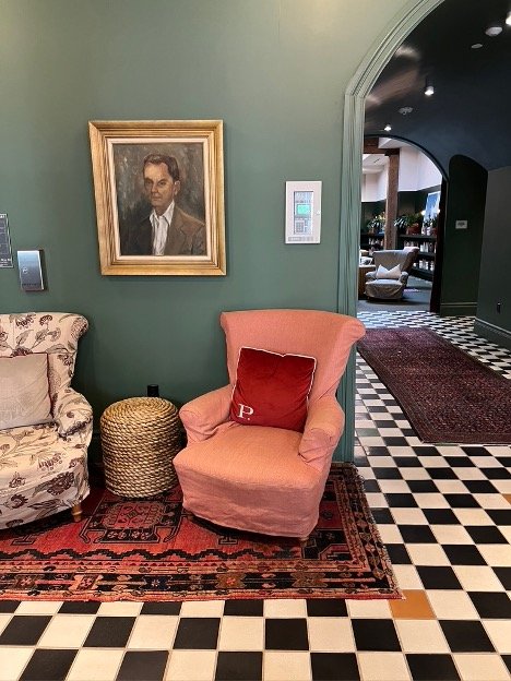


The hotel is worth a peak, or better yet, a stay. The charm doesn’t stop in the lobby, photos from Palihotel’s website show rooms equally full of character and warm invitation.
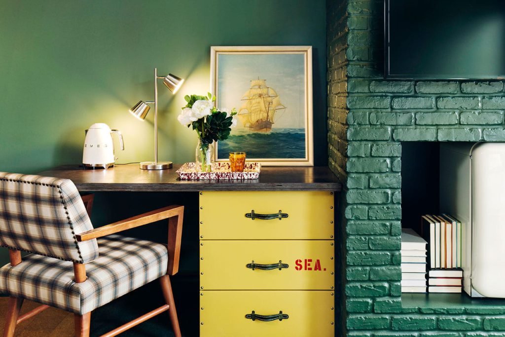
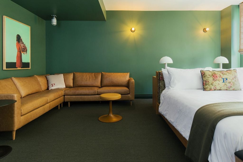


Added bonus: the prices I was quoted were very reasonable. Who needs a pre-spring staycation?

-BHE

Source: https://www.palisociety.com/hotels/seattle

Design Like A Pro

Part 1: Layout and Space Planning

There are a multitude of rules and guidelines in which we spend years learning. We are sharing some of the most important do’s and don’ts here.

Don’t buy furniture without knowing where it will go or how it will fit in a room. This might seem obvious, but we run into this issue time and time again when working with prospective clients. A piece of furniture is completely out of scale, or worse yet, they couldn’t get it through the front door. Interior designers have a distinct advantage when designing rooms and selecting furniture. We create furniture floor plans to scale. Generating a floor plan is an important first step in deciding what pieces (and sizes) work in a space. You can create one by hand or reach out to a designer to do it for you. 

Do move furniture away from the walls if you can. If the space allows, create a central grouping that is conducive to conversation and not cavernous in the center. Highlighting architectural features, which often means the fireplace is also important. Center furniture on either side and don’t block the view to the feature.

Do remember flow. Leave walking paths of at least 36”. The room will feel more welcoming and larger. This is even more important in a dining room where 36” is the absolute minimum for people to be able to get in or out of their seat. If you really don’t have the space, consider banquette seating, it can be a real space saver.


Top Colors This Season

Our Top Colors This Season...


Cool colors have ruled in interiors for the last several years. Cool greys and every shade of blue were everywhere.

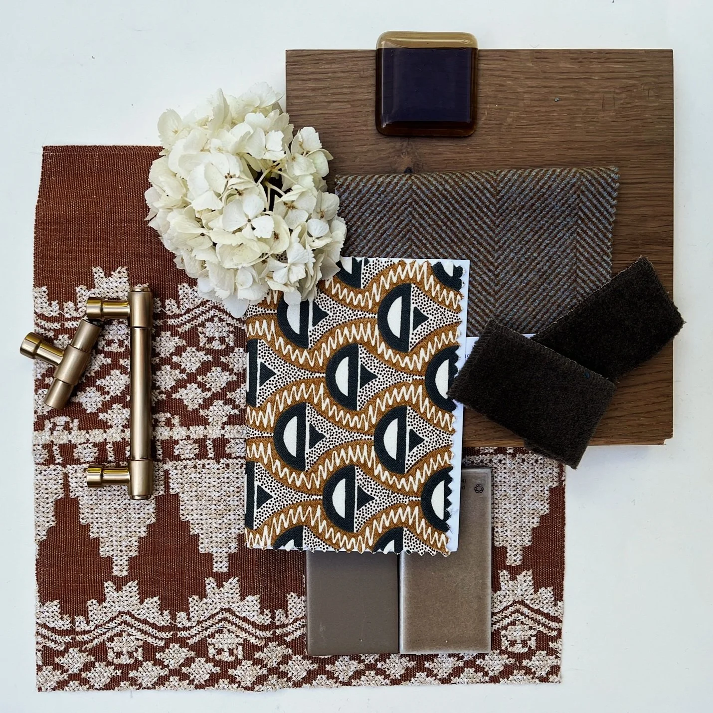
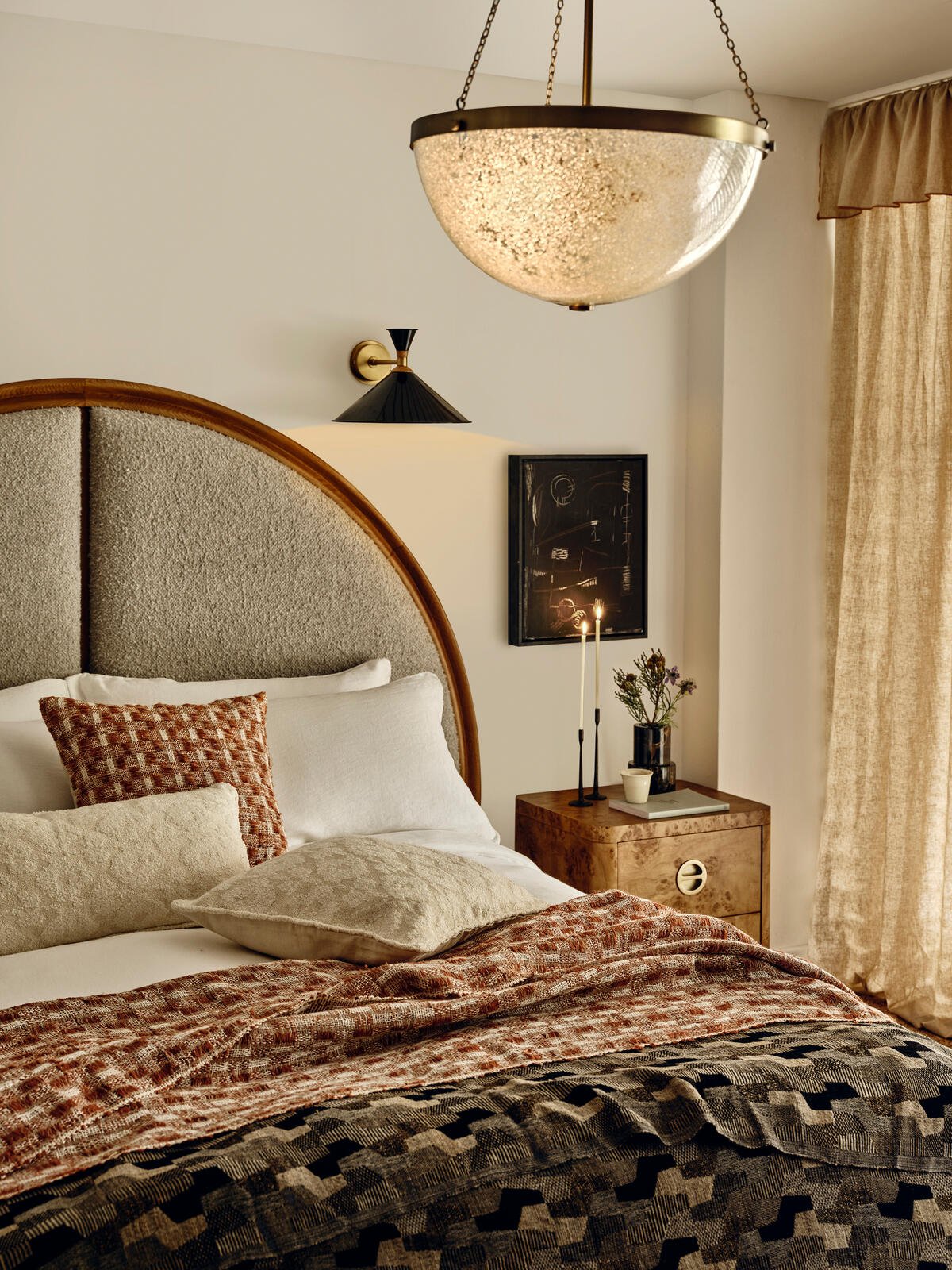
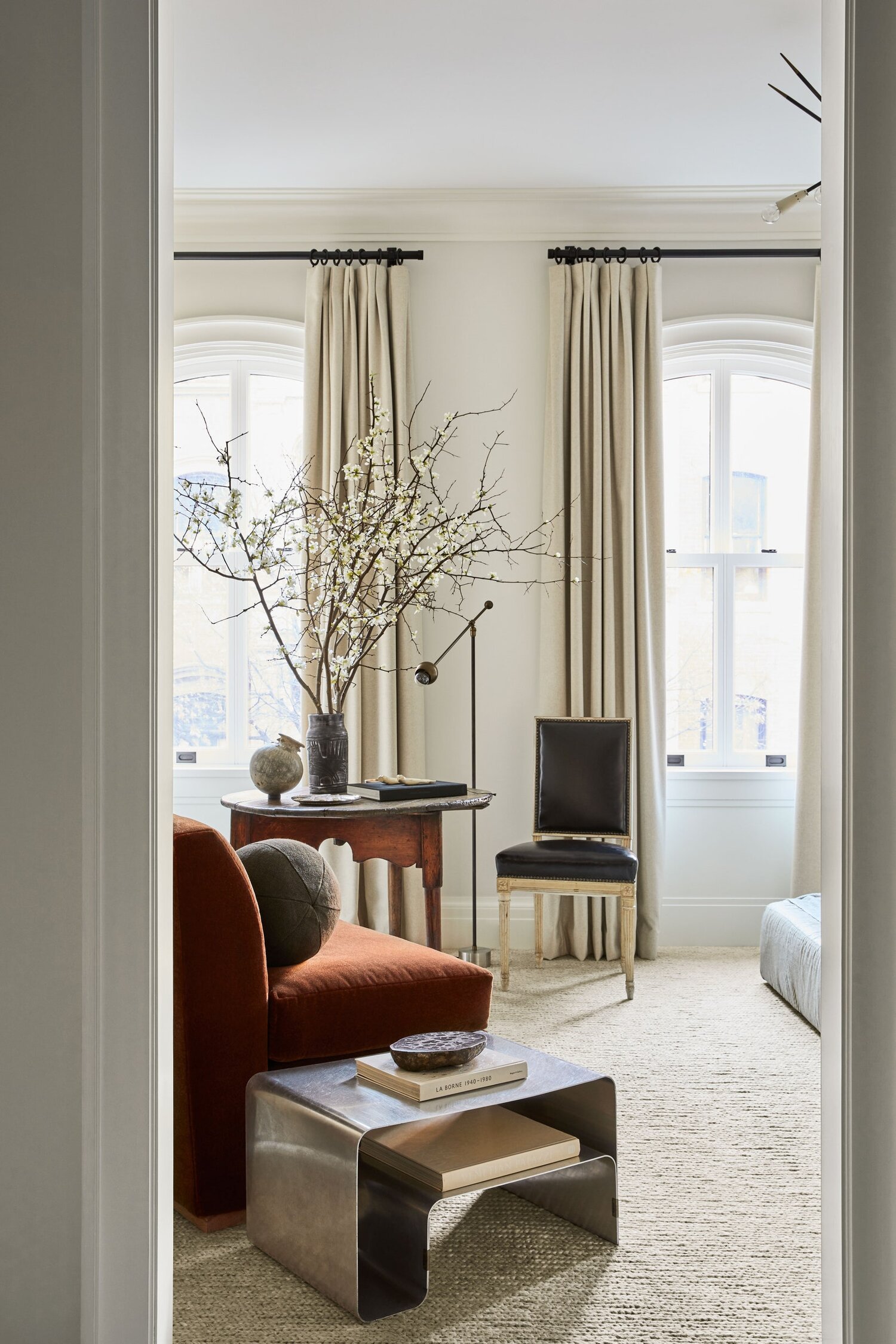
But change is in the air. Gold, rust, orange, burgundy, and tobacco are the colors to be watching for in the coming years. Even whites are warming up and greys mixing with yellow undertones.


Don’t worry if you overdid the blue — warm the blue sofa up with rusty-colored throw pillows or an ivory throw. Repaint the cool grey walls with a linen shade.

Cozy up to the idea and enjoy the warmth of it all.


Accessorizing Your Coffee Table

The coffee table is the centerpiece of a living or family room. How you accessorize it is critical.

Decorate a coffee table the way a designer decorates a room. Using texture, color, contrast and scale are all important when considering accessories. Items that contrast with the surface of the table add interest. A light-colored table looks far more interesting with dark items and vice versa. Mixing smooth items such a glass vase, with a rustic box provides visual interest. And vary the height and scale of the objects. Candlesticks, a vase of flowers, branches or, one of our favorites, a white orchid are great options for taller accents.

Books are always wonderful. You can make a few stacks or just use a couple. Scale the books to the size of the table and stack them to any size that looks right. And make the subject matter of each personal and important to you. Show off who you are. It’s your home.

If you have several smaller items you want to display, consider a tray to arrange those items so that you create an interesting collection. Spreading them out can make the table look disorganized and messy.

Consider a 360 degree POV when placing an item. Leave photo frames for shelves to hide the backsides.

We are big on finding a beautiful box to keep the remote in if there is a TV in the room. Not only does it become a beautiful element on the table it hides a utilitarian element. An antique, a family heirloom, or clean and simple but made of beautiful materials like walnut or Carrara marble could be perfect.

However, creating a menagerie of several items is not for every room. In a room where the scale of the furniture is large and the look is modern and minimalist, consider one statement piece — a sculpture, large plant or beautiful bowl may be all you need.