HED welcomes incoming Senior Interior Designer.

Meet Mike Lee- the newest edition to the HED team.


Name: Mike Lee

Hometown: Seattle, WA

Background: BA Architecture University of Cincinnati, MFA Interior Design Parsons School of Design, 8 years ( NYC) & 2 years (Seattle) professional experience in hospitality/residential design.


Q: What is your role at Hyde Evans Design?

A: Senior Interior Designer

Q: What are your everyday responsibilities when working on a project?

A: Furniture and material selections, drawing and presentation preparation, and coordination with various consultants. 

Q: What was the first space that made a memorable impact on you?

A: St. Henry’s Ecumenical Chapel in Turku, Finland. I tend to be heavily emotionally impacted by the chapels and “death architecture” of Scandinavia.

Q: What are your design influences?

A: Art history, nature, and film.

 Q: Having spent time on the West Coast- how does New York differ from Seattle when it comes to design?

A: New York is far more fast paced, Seattle is a bit more laid back. 

Q: What has been your career highlight to date? What do you still dream to achieve?  

A: Highlight- working with the top chefs in NYC to create beautiful spaces that compliment their art form. Dream- to contribute to Seattle being seen more as a design capital.

Q: What is the best interior design lesson you have learned throughout your career?

A: Maintain open lines of communication and always try to be patient and flexible.

Q: What is the most treasured item in your own home? Why? 

A: My new puppy, Potato. He’s a big ball of energy and joy.

When I’m not designing you’ll find me; baking, running, or out in the wilderness.

When in New York my go to spots are; Maison Premiere, Prospect Park, and any/all of the museums.

 When in Seattle my go to spots are; Kedai Makan, the mountains, and Myrtle Edwards Park.

HED Designer Picks: Iconic Chairs

Scanned straight from the sourcebook- this week HED designers are sharing their favorite iconic chairs. Pieces that have withstood the test of time and earned their spot in the textbook. 

Scans via Miriam Stimpson’s “Modern Furniture Classics.”

Photos via Google Images.

Top 3 HED Bathroom Remodels

HED Designer Picks: Barstool Edition

HED Designer Picks

HED Designers round up their top picks, choosing between designer and luxury items, shapes and styles, our seasoned staff is choosing the best of the best, just for you.

The category is… barstools.


HED Designer Pick with Barbara Hyde Evans

Principal and Founder

The Pepper counter stool by Holly Hunt
HED Designer Pick - The Pepper Counter Stool by Holly Hunt

Hyde Evans chose the Pepper counter stool by Holly Hunt based on its allure and high end appeal. The modern design adds a sculptural element bound to elevate any space.

Find the Pepper counter stool at…

https://www.hollyhunt.com/ShowProduct.aspx?ProductID=23143&ManufacturerID=1


HED Designer Pick with Benni Adams

Principal and Senior Designer 

The Atlantic counter stool by O&G
HED Designer Pick - The Atlantic counter stool by O&G

Adams chose the Atlantic counter stool by O&G for its versatility and functionality. This stool, while sleek and fashionable, serves as a minimalist element in any home. 

Find the Atlantic counter stool at…

https://www.oandgstudio.com/atlantic-counter-stool-24


HED Designer Pick with Amy Lassila

Principal and Project Manager

The Pavilion bar & counter chair by Anderssen & Voll
HED Designer Pick - The Pavilion bar & counter chair by Anderssen & Voll

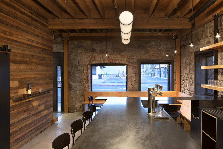
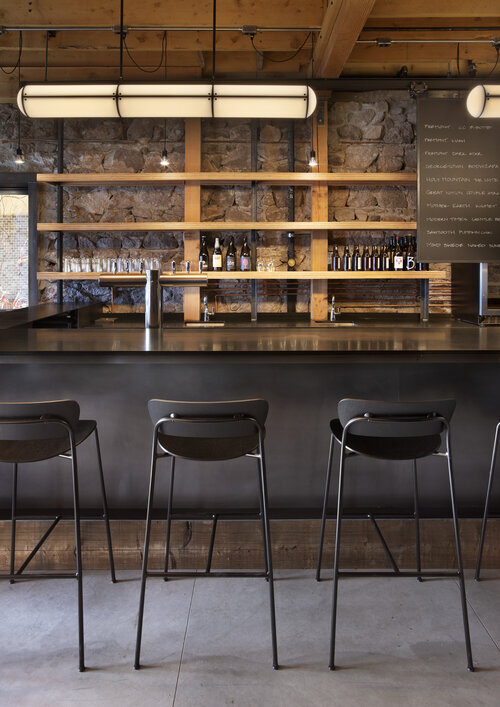
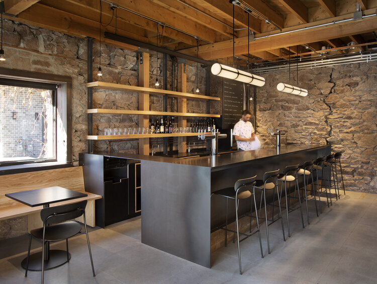
Lassila chose the Pavilion bar and counter chair from Anderssen & Voll for it’s light and airy features. This chair was used in our TNT Taproom project pictured below- see how we incorporated this industrial, yet comfortable chair into the space HERE.

Find the Pavilion bar and counter chair at….

https://www.andtradition.com/products/pavilion-av9.

Antique meets Contemporary

How to unify the old with the new, incorporating time-old and timeless pieces to balance your space.

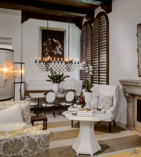
Classis antique and modern contemporary designed living room and dining room

When setting out to tackle our Palm Springs project, Hyde Evans Design was tasked with the challenge of meeting somewhere in the middle between classic antique and modern contemporary. By balancing the proportions of the main features of the home itself and more contemporary accents and furnishings, we were able to achieve a level of personalized modern luxury.

“There is nothing more powerful than juxtaposition to make a room interesting,” Barbara Hyde Evans, Principal & Founder said.

Although the home was traditional, the scale of the rooms turned the space a bit more modern. In this project the majority of the furnishings, and all of the accessories, were antique or traditional- right down to the artwork.

“Antique pieces often have more details to them, lending them a natural juxtaposition to the cleaner lines of contemporary pieces,” Amy Lassila, Principal & Project Manager said.

Incorporating clean, contemporary lines and styles, the space was saved from appearing outdated or fussy.

Classic antique and modern contemporary designed room with built in shelving

Classic structures mixed with modern details elevates a space to newfound luxury. 

Award Winning Coastal Getaway Home.

“This aerie corner retreat overlooking the sea manages to channel a nautical vibe without veering into twee territory...” (Julie Carlson, Remodelista EIC)

Humble coastal style bedroom with grain sack pillows, rag rug and nautical accents

Grain sack pillows, a rag rug, stool bedside table, antique trunk, and nautical accents come together to compose a quaint, humble costal bedroom.

HED intentionally mixed textures; from pick-stitch quilts to heavy linens, and metal framed beds, to create depth within the space.

The room was ideated and executed under the design statement: “This beachfront house was built in 1935. Metal platform twin beds for guests hold a casual assembly of linen and cotton stripes. Boards with hooks line the room and the utilitarian metal wall sconces hang next to each bed. A painted-wood chest and stool from nearby antiques shops serve as bedside tables.”

 While this room looks as if it was pulled from a magazine, you’d be surprised to know all elements, with the exception of the custom window treatments, can be found in retail shops, making the space accessible and attainable for most.

This room took home the award for “Best Professionally Designed Bedroom” in the 2014 Remodelista Design Awards, chosen and awarded by Julie Carson, Remodelista Editor in Chief.

See Remodelista’s Considered Design Award Winners in Issue 33 HERE.


Home or Hotel? How to turn your room into the resort you’ve been missing.

As COVID-19 struck, our vacation plans were the first to go. While we might still be missing sunny beaches and tourist attractions, we’re determined to make the most out of our space and create the perfect getaway (without leaving the house).

Bedroom design with soothing colors and calming tones, featuring Boll and Branch bedding

 Nothing’s better than a freshly made bed. Unfortunately not all of us have housekeeping on hand. Luxe linens and plush bedding build a bed worth jumping into. HED is a fan of Boll and Branch, an online luxury bedding company, with some of the softest pure organic cotton sheets on the market.

Soothing colors and calming tones naturally instill a sense of tranquility in a space- think neutrals and earth tones.

Bathroom design with black hardware and dual sinks

Although housekeeping might not be cleaning up after you each day, maintaining clear surfaces and minimized clutter help aid in achieving peace throughout your home. 

Hallway or entryway table with minimal decor

Fresh flowers and plants add life, a touch of nature invites the outdoors in. Right now- peonies are peaking; pamper yourself with a floral fixture (you’re finally home long enough to enjoy one).

Not into florals? Try a Fiddle Leaf Fig or Ficus - a semi-tropical touch of green guaranteed to brighten your space (and likely your mood).

Decorate your space with artwork that makes you happy, calm, and inspired. Switch out the uniform, cut and copy hotel wall art for a print from a local artist, or a one of a kind painting that customizes your “stay” in your space. Here’s your chance to one-up that trendy resort.

 How are you taking advantage of this (mandatory) stay-cation? Let us know what tips and tricks you’ve tried, down below.

3 tips for mastering small space dining

The best part? You won’t even have to pull up a seat.

An Eat-In Kitchen or Dining Room can serve as the perfect bridge between function and style. Banquette seating cuts out not only the room required to pull out additional chairs, but the clutter of additional furniture all together. One, two, sometimes even three sides of a once small space holds potential to suddenly seat a family, and their guests. This cozy addition adds a little extra personality to create a charming, accessible space. 

Banquette seating design dining room design


That being said- like everything else in the world of design, it can be easier said than done. Hyde Evans Design is sharing our three top tricks for perfecting banquette seating to achieve the perfect dining space.


1.    Get in and get out… quick. 


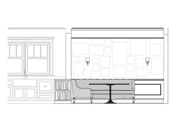
Very rarely does beautiful design make up for a lack of function. If the space is hard to access or uncomfortable to slide into, it will go unused, unappreciated, and take up space rather than saving it. It is important to give the client room to sit and slide into the seating. See the sketch below where we did just that. 

Banquette elevation mockup


2.    Function (slightly) over fashion.


While beautiful prints and patterns may catch your eye, pay careful attention to the type of fabric chosen for the seat- it will need to be smooth enough for the movement and friction is can be expected to endure. Leather or leather-like fabrics lend themselves perfectly for projects of this nature. They’re slick and sleek, plus they are wipeable, perfect for a kitchen or dining setting. Traditional button tufting is a common trend within banquette style seating, if a client loves the look, make sure it doesn’t carry into the seat of the design. Extracting crumbs from each little nook can be infuriating.


3.    Three feet too many.


A classic four-legged dining table will defeat the purpose of an eat-in space. Extra and unnecessary legs under the table will only clutter the space and make it difficult to make room the legs you actually want,  those of your family and friends. Consider pedestal base or trestle tables- like the ones pictured below. We often have a custom build designed to ensure the perfect fit.  

Banquette dining room seating design

OUR GO-TO NEUTRAL PAINT COLORS

Look, we get it. Picking a paint color is HARD. We have many years of experience (over 30 for one of us!) and it is still difficult. So we are sharing our favorite neutral paint colors for those searching for the perfect shade. 

Grey Owl color swatch by Ben Moore

Ben Moore Grey Owl

It’s the perfect pale Grey/Blue/Green. We have used it in living rooms, kitchens and bedrooms and clients LOVE it. Very soothing, light and airy.

Living Room in Grey Owl by Hyde Evans DesignPhoto by Benni Adams

Living Room in Grey Owl by Hyde Evans Design

Photo by Benni Adams

White Dove color swatch by Ben Moore

Ben Moore White Dove

White Dove is our go-to white. It’s not too white, not creamy, not pinkish or blueish. In other words, just right. We often use White Dove for trim in a satin finish. We have also used it for cabinetry and walls with great success.

Bathroom in White Dove by Hyde Evans Design

Bathroom in White Dove by Hyde Evans Design

Photo by Benni Adams

Platinum Grey color swatch by Ben Moore

Ben Moore Platinum Grey

It’s a mid-tone grey with just the slightest hint of warmth to it, so it won’t go blue on your walls. It adds a rich background to cozy up a living room or dining room. We have also used it on the island in an almost, all-white kitchen.

Living Room in Platinum Grey by Hyde Evans Design

Living Room in Platinum Grey by Hyde Evans Design

Photo by William Wright

Ice Formations color swatch by Ben Moore

Ben Moore Ice Formations

A perfect warm, pale grey. Be aware that a small sample may look too dark at first, but spread out on your walls, it will be just right. We’ve used Ice Formations as the main color running through a home, but it has also worked well in kitchens and family rooms. It’s just light enough to be able to use even in smaller rooms.

Tricorn Black color swatch by Sherwin Williams

Sherwin Williams Tricorn Black

Tricorn black has the slightest bit of warmth to it, but otherwise is a very true black. Believe us, black is one of the hardest colors to get just right. Black paint can easily turn to Blue/Black or Green/Black, but we have had nothing but success with this shade.

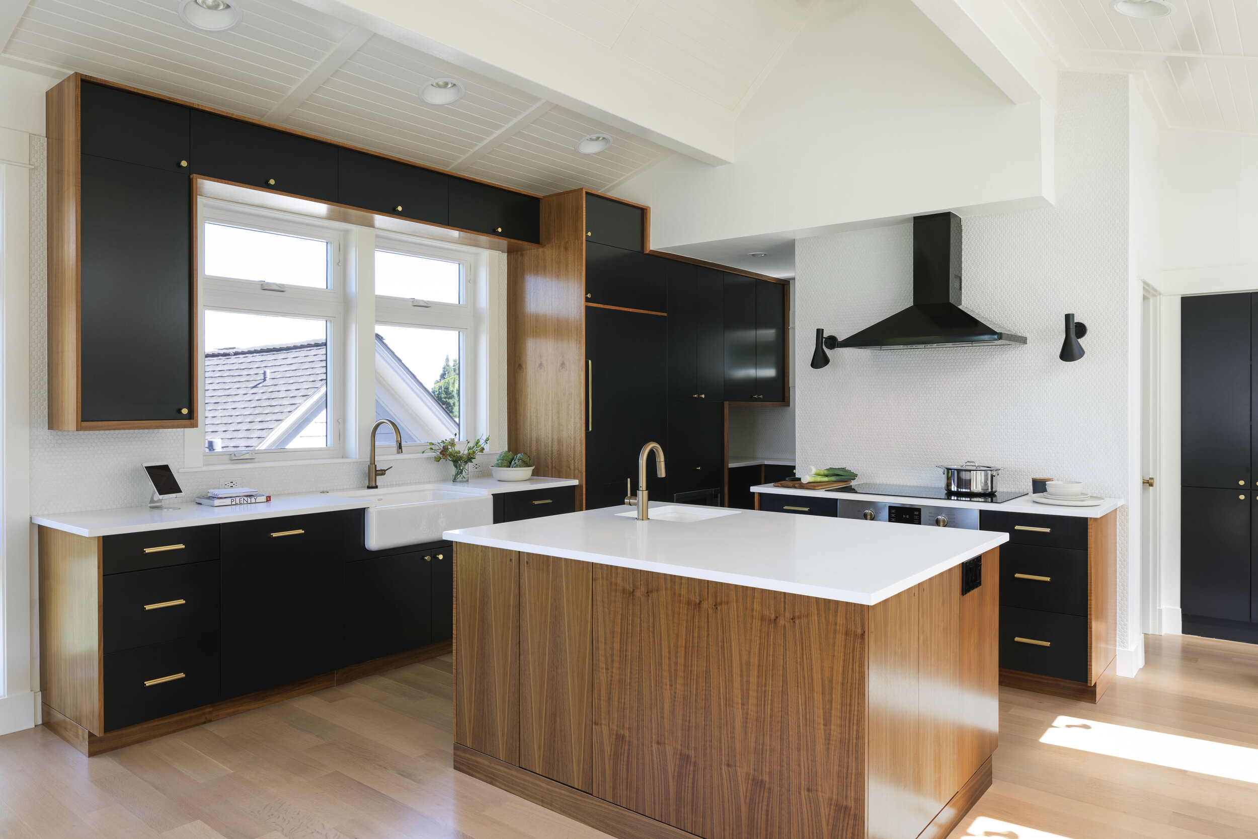
Kitchen Cabinetry in Tricorn Black. Kitchen designed by Hyde Evans Design

Kitchen Cabinetry in Tricorn Black. Kitchen designed by Hyde Evans Design

Photo by William Wright

Glidden Distant Mountain color swatch

Glidden Distant Mountain

Distant Mountain is Pale Cool Grey with a hint of green. We used this in a living room, dining room and entryway. A lovely, subtle, soothing color. The client loved this color so much that she requested it for the walls of her new home.

Living Room in Distant Mountain by Hyde Evans Design

Living Room in Distant Mountain by Hyde Evans Design

Photo by Ben Benschneider

THE VERSATILE PILLOW

Pillows in a room may be small in size but their role can be huge. I mean, HUGE. To the point where they can make or break the setting.  

They can add an accent color that your room is screaming for.

Every room needs an accent color.  Sometimes the smaller the item with the accent color the bigger the impact it makes, so a pillow or two can be a perfect way to accomplish that. Consider either a high contrast color for the pillow, like indigo on a white sofa, or a compliment like gold in a room done entirely of blue and white.

Living room design featuring dark sofa with accent pillows

They can add a touch of cool if the whole room is warm, or vice-versa. 

A room just looks off if it is all done in blue or cool grey without a hint of a warm color.  And the same happens in reverse.  You could feel like you are burning up in an all red or all yellow room without a hint of blue, green or cool grey.

Navy and white bedroom design with orange accent pillows

They can add the texture the room needs.

Limit the texture in a room and the room just looks blah.  Pillows are the perfect way to add a touch of whatever the room needs.  No plushes in the room, like velvet or chenille?  Add a white sheep skin pillow and you have instant cozy.  Everything looks dull? Add a bit of shine with a silk pillow or even something with a little sparkle.  You won’t believe the difference it will make.

Room design featuring gold accent pillows

They can add style and make a statement

Want to go trendy but that doesn’t work with your budget for long term?  We run into this a lot.  Invest in good neutral colored furniture and add trendy looks or colors with the pillows.  They are much easier to update than, say, an entire sofa.

Say you love animal prints.  Animal prints come and go in style.  Rather than risk the look of the room getting dated too quickly by papering the walls in a leopard print, cover a pillow in it.  If you tire of the look you can have a new cover made for the it or purchase a readymade one.

Bedroom design featuring animal print accent pillows

They can change with the season.

I have clients who love a summer look and a winter look particularly in their living room. Some even like a holiday look. Changing accent pillows out is the quickest easiest way to accomplish that.  In the spring/summer go with brighter, lighter looks in cotton and linen. For Fall/Winter switch to velvets in fall colors or sheepskin and add a throw and you’re all set to cozy up around your fireplace.

Living room design featuring light green accent pillows

Veranda Magazine, October 2010

They can add comfort.

We designed a home for a couple whose heights where drastically different.  He was 15” taller than she was. Pillows where a lifesaver so that they could both sit comfortably on their sofa. But even if that is not your situation, a lumbar pillow or something to put under you head can make a room more comfortable for yourself and everyone who visits, no matter their size or needs.

room design with blue couch featuring accent pillows

Fall Review: What we’re seeing for Kitchens

While kids are picking out their rulers, notebooks, pens and pencils we are taking a look at kitchens for stand out trends this year and moving forward. Transitional and contemporary kitchens are still the leaders, so it is no coincidence that the trends we discuss here fit into those categories.

Skip the Uppers

Not only does skipping the upper cabinets create a more spacious feel, but it allows for more window space and therefore more natural light and immediate connection to the outdoors.

Hyde Evans Design_Interior Design Seattle_Laurelhurst Mid-Century_1_2 copy.jpg

Uniform Island Height

The kitchen island with classic, uniform height is the strong choice for kitchen islands. Islands with a raised bar for seating and to conceal food preparation were popular for a while but are receding as the classic island height proves a more unifying and open solution for the space where everyone loves to gather.

Kitchen design with classic large kitchen island

Backsplash

We still see the 3 x 6-inch tile in running bond for backsplashes; they are classic and cost effective.  But smaller and larger tile sizes in patterns such as stacked or herringbone or tiles with texture are fresh alternatives. Also, stone slabs offer a bold statement.  And not just calacatta or carrera marble!

Kitchen design with floating shelves and a marbled black and white backsplash

Color

As we all know the white kitchen is a timeless choice. It is still a great option and will continue to be one.  But more and more color is coming into the kitchen including deep blues, hunter greens, grays and blacks with exciting results.

Kitchen design with navy cabinets

Cement Tile

There is an argument that cement tile is a sustainable choice.  As a bonus it looks fantastic, adding pattern and visual interest to one of most used spaces in the house.

Fewer Farm House sinks

And, undermount sinks are back as the go-to kitchen basin.

Kitchen design with cement tile walls

Photo through Granada Tile, www.granadatile.com

Matte Black Appliances

As an alternative to stainless steel we are seeing more and more appliances in matte black.  Matte black adds stunning contrast and mood.

Kitchen design with matte black appliances

Photo through Cococozy

Brass Hardware

It works fabulously with navy, black, green and white. Check, check, check, check.  So, whatever the scheme, brass hardware adds warmth.

Kitchen design with brass hardware

Statement Fixtures Over the Island

We are all in love with sculptural lighting. And the kitchen has felt the influence. We are seeing more statement pieces over the kitchen island as well.

Kitchen design with statement light fixtures over the kitchen island

And these are just a start! We haven’t even addressed smart kitchens, kitchens embracing the efficiency of ever rapid gains in technology!

Stay tuned for our upcoming and related blogs on Kitchen banquettes and kitchen appliances…


How to Style Your Bookshelves

Bookshelves in any room add not only a homey, cozy feeling but also great texture and visual interest. 

How you arrange your bookshelves, however, is critical.  Sloppy or unorganized shelves can make the whole room look that way.  Here’s everything you need to know to do it right. 

Bedroom design featuring a white bookcase with decor

Work with a Color Scheme

Okay, I know what you’re thinking: books come in all sorts of colors.  That’s okay!

You can still “push” a color scheme by highlighting the colors you are most interested in.  Certain books can be placed in more conspicuous places such as at the top or end of a stack. Then add accessories that follow through with the scheme.  

Room design with built in white bookcase

There are ways to take it to the extreme. For example, covering some or all books in paper of the desired color. 

Colored books stacked on top of wood table

Photo by Design Milk

In one project we turned the binding inward. I wouldn’t suggest that if you use you books frequently.  It will certainly be more difficult to find what you are looking for!

Give Your Bookshelves a Theme 

Accessorize your shelves with a collection that you already have or start a new collection of whatever interests you.  Lets say you collect globes, antique toys, family photos, stoneware pottery or jars full of shells and nautical prints.  I could go on! 

Bookshelf accessorized with scissor collection and other decor

Vary How Books are Arranged

Vary the look of each shelf. To accomplish this more easily consider stacking some books instead of arranging them all vertically. 

Built in bookshelves with varying book arrangements

Stop short of filling a shelf with books by adding bookend, a stack of books, or an accessory heavy enough to hold them.  Adding a small accessory on the top of a stack of books will add interest.   A larger accessory on a shelf by itself also works beautifully.  

Built in bookshelves accessorized with books and decor

Decorating from Scratch, or nearly Scratch

Let’s say you have a blank slate; you just added on a family room to your home, you’ve moved from a traditional home to a modern Condo, or you just bought your first home.  

Empty living room with stone accent walls

Maybe you have inherited a few furniture pieces or want to bring a few things with you from your last place.

How do you make your new space perfect?

Here are a few basics:

Start by photographing and labeling images of things you want to keep; everything from accessories to entire rooms will help you define what you would love to live with.  

When we work with a new client we create what we call a “Style Book.”  After seeing their new space in person or in floor plans, we make a book of tear sheets that hopefully represent every possible style that would work well in the home. We include images of anything that the client wants to keep. We go over it together.  This step is a real time-saver to help rule out any real “no no’s” and to establish a direction.

Two different living room styles side by side

   Photo: Elle Decor                              Photo: Architectural Digest 

Keep in mind that consistency is important in home style, so if it is a new addition to your home, you’ll need to take off from the already established style and color scheme.

Next establish a furniture floor plan.  If you don’t have the budget to have a designer help with the design of the entire room, it might be smart to at least have them complete this step.  If you want to measure your room yourself and take tons of photos of the space, most designers would be happy to work with that.  Having a floor plan that works for you and provides furniture sizing allows you to do your own shopping with far fewer errors.

Master bedroom floor-plan

Develop a color scheme that has contrast. Any color palate will fall short without the benefit of black and white added to the scheme.  An easy way to take it from there would be to find a fabric, a piece of furniture, or an accessory that you like and develop the rest of the scheme around that.  Alternatively, you can use one of the images that had a scheme you admired as your inspiration.

Room design with black and white color palate

Add texture: a plush, like velvet or a handsome flat weave; and shine, such as a glass tabletop. All are great possibilities.  Other options are a rug with tons of texture or window treatments with a touch of shine; either will make a room far more interesting.

Master bedroom design with high wood rafter ceilings

Lighting can make or break a room.  We always make sure seating has a reading lamp nearby (and a place to set a beverage). But don’t stop there. You should vary your sources.  You’ll want general room lighting like a center fixture or recessed can lighting, lamp lighting, and accessory or spot lighting.  Floor lamps can be a great-added touch.  

Living room design with black floor lamp

Make sure you add accessories to your space for more interest and texture.  Even if you are going for a minimalist look, a plant, a stack of coffee table books, etc., make a room more interesting and personal.  

Room design with accent table

ALL EYES ON THE FOOT - KEEPING FRESH EYES ON THE FOOT OF THE BED

The foot of the bed and the furniture pieces we often situate there are part of a long tradition in bedroom design.  Pieces like storage trunks or benches have long served practical purposes and, in many cases, still do for that space. But it is certainly not necessary to restrict oneself to preconceived notions of what to place there particularly if traditional solutions don’t fit the size of a room or the way you use your space.

A storage trunk is a traditional choice that offers a perfect place for bed linens and can add character, perhaps be part of a family’s history.

Bedroom design with storage trunk at the end of the bed

A bench has long been the frequent go-to piece for the foot of the bed as it provides an occasional and convenient place to sit and is a great place to toss off the quilt when it gets too warm.

Bedroom design with bench at the foot of the bed

But, think outside the box.  It certainly doesn’t have to be the expected. The single bench could easily be replaced with two small ottomans, two chairs or a loveseat.

Master bedroom design with two small ottomans at the foot of the bed

For a large space, place a sofa there to act as a seque to an adjacent sitting area.

Master bedroom with sofa at the foot of the bed

In contrast, in a small home or Master Bedroom the challenge may be how to fit everything you need. Creative solutions can look fresh and solve the dilemma!

Bedroom design with small desk and chair at the foot of the bed

A low bookcase is also an efficient choice -

Master bedroom design with a low bookcase at the end of the bed

The foot of the bed can also be a great place for a long, low dresser,

Bedroom design with low dresser at the foot of the bed

Or a dog bed, so Blackie has his own place to sleep!

Bedroom design with a dog in a dog bed at the foot of the bed

Photo: Elle Decor

And, if you are serious about your television watching…

Master bedroom with a hidden television at the foot of the bed

The list goes on. So, if the traditional options don’t serve your space, fear not.  It can often be the need for an alternate solution that sparks the creation of fresh and fabulous ideas!


IT’S SO SHINY!

Okay you’ve selected the paint color. Now for the sheen.

Here’s what we do, in general:

We love a flat or matte sheen on walls and ceilings.  There was a time, however, when this wasn’t always the smartest choice.  The argument was it wasn’t easy to clean.  It wasn’t wipeable.  So we would up the sheen for kids rooms, family rooms, and hallways. That has changed now that major paint manufacturers have developed wipeable flat sheens. Besides the soft look of the finish, flat paint does a better job of hiding little imperfections and it can more easily be touched up without leaving brush marks.

We go with eggshell for Kitchen and Bathroom walls and ceilings. Eggshell is more wipeable than flat and absorbs less moisture.

Kitchen design with eggshell matte sheen paint

If your Kitchen is open to a living area then the washable flat paints are perfect. They cost a bit more, as a matter of fact sometimes twice as much, but it could be well worth it.

Generally speaking we go with eggshell for trim in more casual homes. 

Bright orange chairs

For more formal or larger homes, we’ll go with satin or semi gloss for trim.

Dining room with long black table

If you are looking for something more dramatic semi-gloss or even gloss can be stunning on walls and/or ceilings. But, be aware your walls need to be in perfect condition and the paint needs to be applied perfectly. Paints with higher sheen levels show everything. 

Office design with black gloss paint on the walls and built in bookcase

Shinier paints reflect light, which creates an amazing affect and a major wow factor. We once did a Powder Room in a black gloss. For dinner parties the clients would light candles and use the dimmers on the lights. Gorgeous.

Barbara Hyde Evans
Hyde Evans Design

MIX IT UP

I was years into my career as an Interior Designer before I could really grasp how to make a mix of furniture styles come together to make a fabulous room.   

Dining room design with long black dining room table

Beautiful spaces with a blend of styles may appear unconsidered but realistically most are well thought out.  Bottom line, you can’t just throw pieces together haphazardly and expect it to work.  It takes careful and deliberate use of juxtaposition and contrast.  

Living room design with grey colored couch, fireplace and grand piano

Mixing styles demands that you carefully follow proven rules for designing a space, even more so then when you are doing a room in say a Traditional English or Northwest Contemporary fashion.

Color, contrast, texture, scale all need to be in careful balance. This is not for the faint of heart, but if you love the idea, let me give you some easy ways to capture the look.

Do a beautiful mix of Contemporary furniture in the room then add just one, or maybe two, antiques. The contrast between the two styles will be stunning.

Dining room design with long wooden table, white chairs and floor to ceiling white shelving with glass doors

Alternatively, design your room completely in traditional furnishings then cover the walls with contemporary art.

Dining room design with varying artwork on the walls and wood table

If you follow these tips and your space still doesn’t feel right, consider hiring a professional who has a reputation for doing it well. It will save you from expensive mistakes.


Barbara Hyde Evans
Hyde Evans Design

2018's HOTTEST COLORS, THE DEFINITIVE LIST

Every fabric line, every rug manufacturer, every paint company, etc. declares their color of the year. As an interior design firm we have the opportunity to view all the latest in fabrics, wallpapers, tiles, carpeting, and every other surface for the home. So we made up the ultimate list. Here it is:

BLACK

Virtually every major paint company has declared some shade of black as their color of the year. They are a blue/black shade, a purple/black shade and, of course, a charcoal. Not totally new, as we saw plenty of the trend last year especially in wall color and cabinetry. And every good designer will tell you that every room, even an all white one should have black in it, even if it is just a touch. Black adds contrast and drama. Add black to all lavender room and suddenly it’s sophisticated.

Office design with black framed windows

GREEN

It too was big last year but in 2018 it comes on even stronger. Emerald is awesome. Green marble makes a breathtaking statement. And green and black together, killer!

Living room with green accent couch

VIOLET

Declared the Pantone color of the year, violet is making its way into every fabric line. And, yes, it is daring but makes a stand out wall color.

Dining room with wood table and violet chairs

RED

Let’s face it, jewel tones are back, and red is an important one. It warms up any room as a wall color, a piece of furniture, or just a lamp base or pillow.

Living room design with red accent chairs

So go vibrant, go colorful, make a statement in 2018!

Tis the Season In Seattle

Holiday shopping is in full swing! This month’s blog is dedicated to helping you find that unique gift for the home. Here is a list of Seattle boutiques that offer vintage items, accent pieces, artwork, and objets trouvés that add interest, depth and character to a space. Happy Shopping!

Living room design with light grey sofa and accent pillows

Belltown

Fancy on Second Avenue in Belltown for unique tables and lighting

http://www.heyfancy.com/house/

Geometric light fixture

Capitol Hill

Totokaelo in Capitol Hill for pillows, throws and objets trouvés

http://totokaelo.com/art-object

Minna throw blanket

Butter Home on Melrose Ave. is a loft like space with a country feel filled with items such as wire storage baskets, wall art, and lighting.

http://www.butterhomeseattle.com

Leather handle wire basket

Retrofit Home on East Pike Street has a mid-century vibe with furniture and more.

http://www.retrofithome.com

Downtown

Watson Kennedy, near Pike Place Market and also on 1st & Spring, is filled with fine accessories and features affordable art prints by Hugo Guinness

https://www.watsonkennedy.com

Georgetown

Susan Wheeler Home on Airport Way South is packed with pillows, French antiques, and mirrors.

https://susanwheelerhome.com

Kirk Albert on Airport Way South for vintage objects and quirky finds

http://www.kirkalbert.com/27styh879xi9bvu47dlc48jojjhdkv

Vintage movies sign

Madison Park

Marine Area 7 in Madison Park for vintage items for the Kitchen - They have a terrific Instagram feed @marinearea7, so you can check out them out before you make the drive.

http://www.marinearea7.com

Pioneer Square

Flora and Henri in Pioneer Square for books, bedding, porcelain, artisan ceramics and much more…

https://florahenri.com/collections/live-love-maison

Spiky ceramic bowl

SoDo

Big Daddy’s on First Avenue South for eclectic, one of kind pieces and antiques

https://www.bdantiques.com

Upper Queen Anne

Stuhlberg’s on Queen Anne Ave. N for more traditional items, including baskets, pewter and silver frames.

http://www.stuhlbergs.com/our-products.html


Pewter wine carafes

Many of these boutiques are in neighborhoods surrounded by other shopping and fun dining options, so you can immerse yourself in the spirit of the season.  

Best wishes for a Festive Holiday Season!

White bookcase with stacked books and other decor