Some rules just make things better! Like traffic rules. We all get around a little easier because of them. Similarly in the home there are some general dimension rules for furniture distance that make a room feel and look better and indeed allow for better foot traffic flow.
Apartment Therapy makes a case for sticking to the rules in this link…
http://www.apartmenttherapy.com/dimensions-to-follow-proper-furniture-spacing-basics-149156
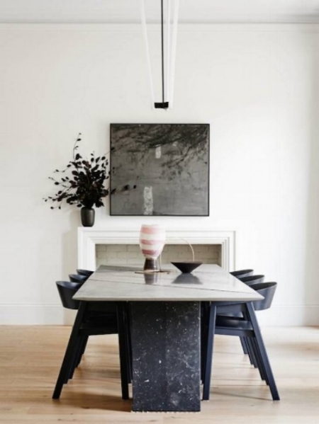
Apartment Therapy gives a general range for the optimal distance of a chandelier over a Dining Room table. Another tip is that a smaller chandelier should hang higher over a Dining Room table -
Architonic / Robson Rak / Photo: Brooke Holm / Marsha Golemac
While a larger one should hang lower, closer to the table -
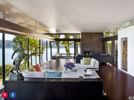
In addition, larger scaled rooms or furniture look better with more generous spacing in some areas, like walkways.
Keep walkways open for free movement within and between rooms, a minimum width of 36 inches when possible. If you’re thinking rules, rules, rules! Here is one you can break. If there’s a natural path that leads from the Front Entry immediately to a back door, break that up with a centering table or sculpture, something delightful that encourages you to linger and enjoy your beautiful home before rushing right back out!


