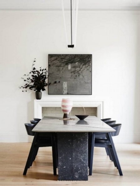
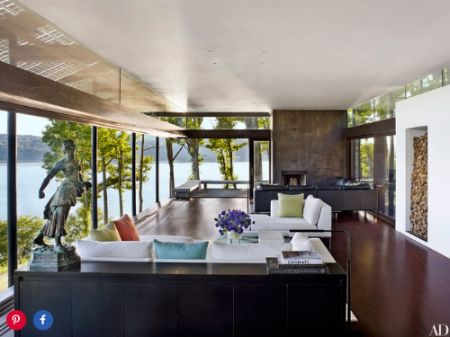
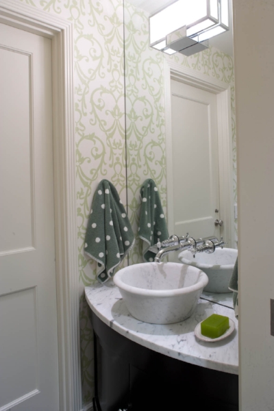
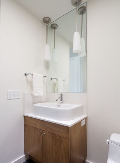
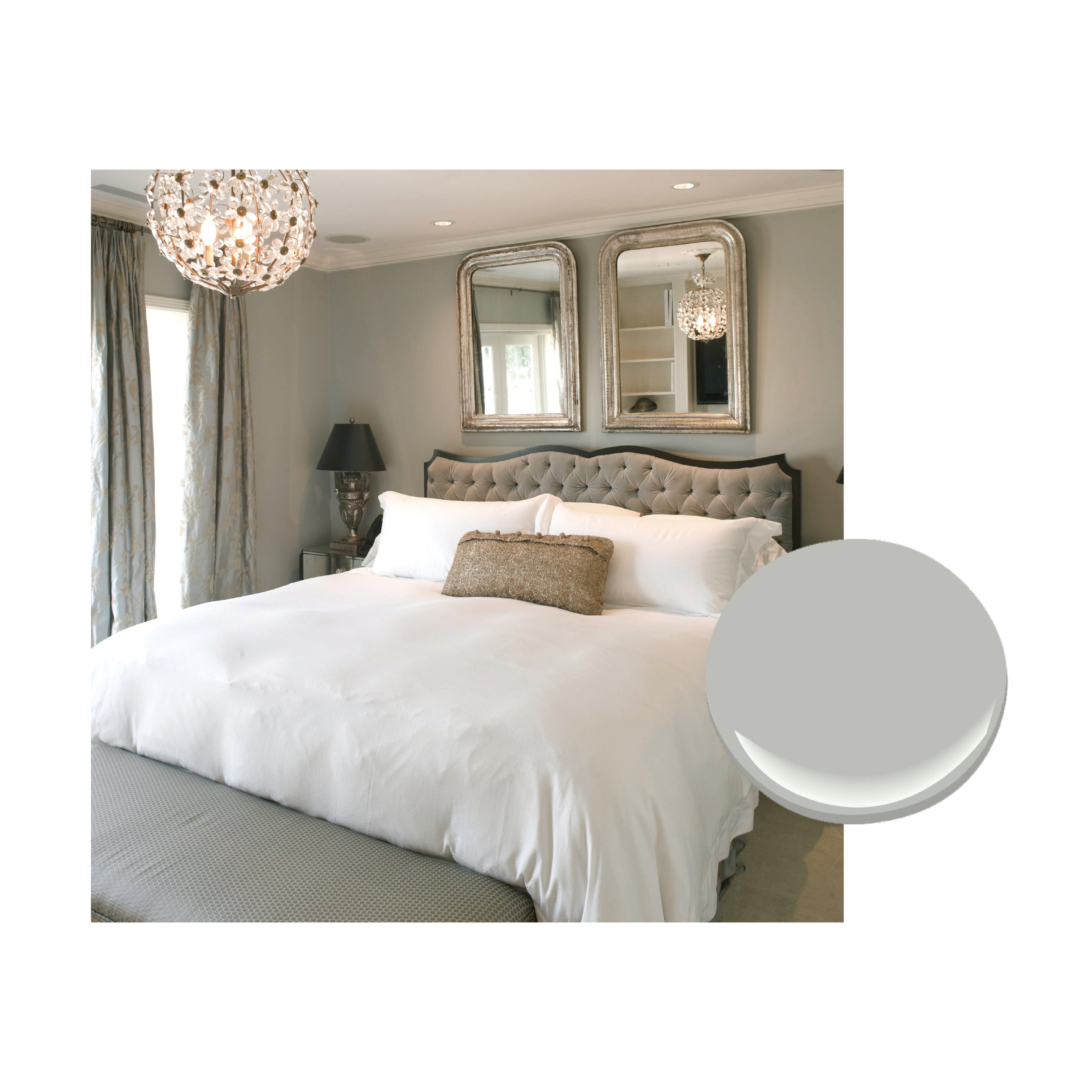
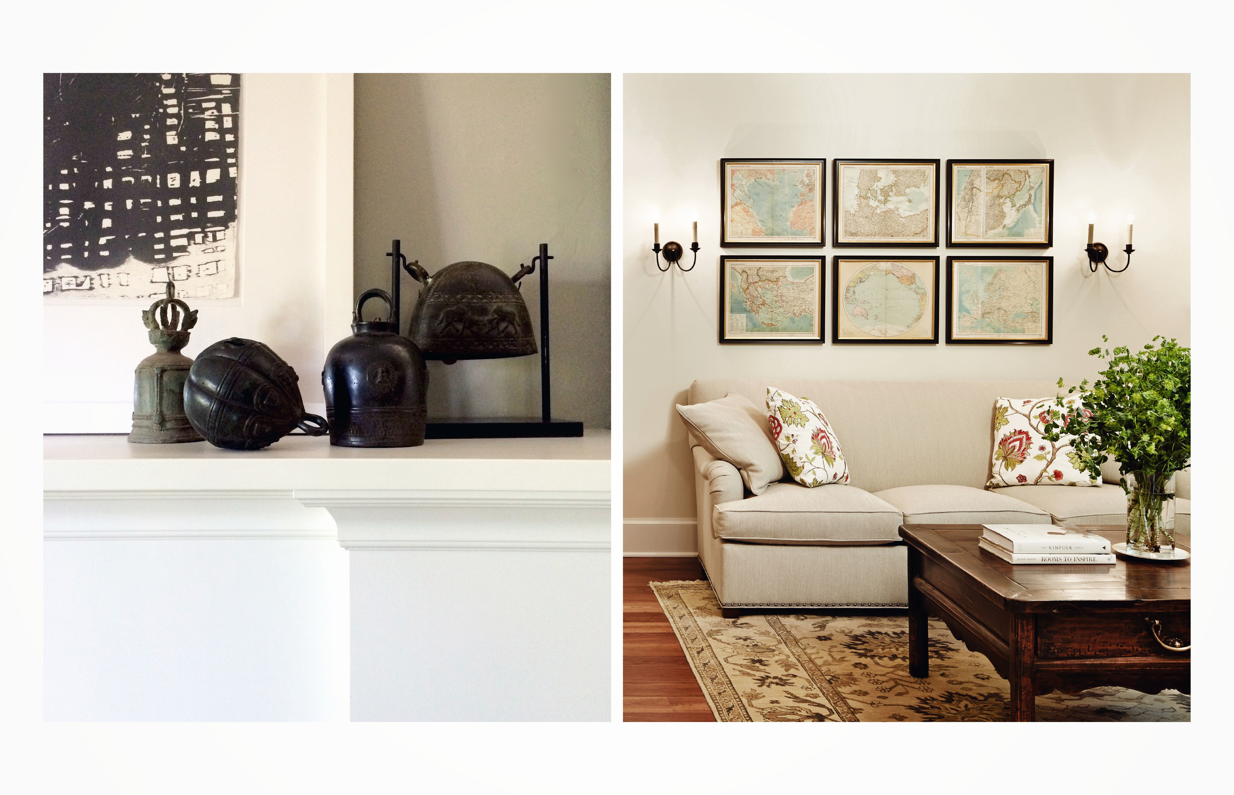
Don’t Disregard these Dimensions

Some rules just make things better! Like traffic rules. We all get around a little easier because of them. Similarly in the home there are some general dimension rules for furniture distance that make a room feel and look better and indeed allow for better foot traffic flow.

Apartment Therapy makes a case for sticking to the rules in this link…

http://www.apartmenttherapy.com/dimensions-to-follow-proper-furniture-spacing-basics-149156 

Apartment Therapy gives a general range for the optimal distance of a chandelier over a Dining Room table.  Another tip is that a smaller chandelier should hang higher over a Dining Room table -

Dining room design with dining room table and chairs and small chandelier
Dining room design with dining room table and chairs

Architonic / Robson Rak / Photo: Brooke Holm / Marsha Golemac

While a larger one should hang lower, closer to the table - 

Dining room design with large chandelier

In addition, larger scaled rooms or furniture look better with more generous spacing in some areas, like walkways.

Living room design

Keep walkways open for free movement within and between rooms, a minimum width of 36 inches when possible. If you’re thinking rules, rules, rules! Here is one you can break. If there’s a natural path that leads from the Front Entry immediately to a back door, break that up with a centering table or sculpture, something delightful that encourages you to linger and enjoy your beautiful home before rushing right back out!

Powder Rooms - Go Big in these Small Spaces

At first glance the Powder Room is simply a necessary, functional, small space. But in terms of designing the space within the context of the home as a whole, think twice and you’ll realize it is a big space when it comes to design potential! You and your family won’t be the only ones to benefit from the design love you give to the Powder Room.  It is a space that many of your guests will see too.

It is exactly because of its small size that you can make adventurous design choices there.  The only rule, if any, is that is should tie together in some way to the design of the house as a whole.  But in that, the capacity for interpretation is broad! This is especially liberating if you are not particularly adventurous in the main spaces of your home.  So have fun and go bold,

Powder room design with large mirror and black walls with light colored floral design

Go colorful,

Powder room design with white and green accent colors

Go minimal.

Minimal powder room design with white walls

Try dynamic tile flooring, from sources like Cement Tile Shop or Clé Tile,

Dynamic black and white tile flooring

http://www.cementtileshop.com / https://www.cletile.com/collections/cement-tiles

Splurge for that stunning surface you’ve been eyeing,

Powder room design with gold and lavender accents

Or go clean and contemporary, perhaps explore sustainable. 

Contemporary powder room

Of course, as with any space there are parameters and functionality concerns that will guide and inform decisions.  After those have been addressed, let the fun begin!

"...black has it all. White too. Their beauty is absolute. It is the perfect harmony." -Coco Chanel

We have a great excuse to highlight this Coco Chanel quote in our blog this month.  It is a tie-in to the title of the upcoming article featuring us in The Seattle Times, “Dreaming in Black and White.” 

Check out the article, written by Sandy Deneau Dunham in this Sunday’s, January 8th, Pacific NW Magazine.

If you love design, you rarely need an excuse to consider the timeless team of black and white.

Whether they are included as part of a greater scheme,

Dining room design with large wood dining room table and large wood chandelier

or are the plan for an entire space, Coco Chanel’s words ring true again and again. It is as true for simple spaces with clean lines

Bathroom design with his and her sinks, black hardware, white cabinets and black counter tops

as it is for spaces filled with pattern and variety.

Floral pattern wallpaper

Black and white are gorgeous alone in their complementary purity as well as when they are accented with color.  

Black and white kitchen design

In any case, there is no doubt that “the perfect harmony” of black and white in interior design as well as in fashion is just as timeless a duo as the singular lady who spoke these words to describe them.

Finding Center - the Kitchen Island

It's happened to all of us.  We invite friends over or the whole family will be together and we prepare our home for a group.  When everyone arrives we all gather around the Kitchen Island as if it’s a magnet drawing us in. The other areas of the home are left quiet or at best sparsely attended.

We've finally stopped fighting it! Now we embrace the Kitchen Island as The gathering hub. And the results are delightful.

Whereas the fireplace used to be the center of the home, now it is the Kitchen Island. And it’s not just in the case for special gatherings. If you have a large family, it may be an ongoing natural hub.

Black and white kitchen design with large kitchen island in the center

How does this influence the choices we make when designing an Island and/or the Kitchen as a whole? Seeing successful answers to that question can help. 

For example, creating a larger Island around which more people can stand or sit,

Kitchen design with long kitchen island in the center

increasing the empty space around the Island,

White kitchen design with narrow kitchen island

or including more than one Island!

Kitchen design with two kitchen islands

Opening up the floor plan so the Kitchen and the Dining Room or Breakfast areas merge is another possibility. This can be equally successfully when designed with a contemporary concept-

Kitchen and dining room design

or with a more traditional one.  Among others.

Kitchen and dining room design with kitchen island

In an open floor plan the Island can separate the Kitchen from the other areas while keeping them connected.

Kitchen and dining room design with the kitchen island separating the two rooms

And in a Hyde Evans Design project in Eastern Washington, a bar height counter provides equally comfortable seating or standing and serves to block the Kitchen work surfaces from the other areas.

HED kitchen design with bar height counter as island

The gist of it is that we can break out of the traditional Kitchen floor plan if it no longer reflects the real way we live and interact in the space and now customize our Kitchens and Kitchen Islands for the way we actually use them.

Cheers and Bon Appétit!

“Now, where’s the remote…”

We’ve answered the perennial question that concluded our October blog, “Now, where’s the remote…”

It’s in the cute box on the table, of course!

Coffee tables need accessories, so you can skip the drawers in the table and add an eye catching design element instead!

We found four cool, inexpensive options at the antique market at Pacific Galleries in downtown Seattle.  If you look closely, a few have the prices on them. 

Antique brown box
Antique black box
Antique bronzed metal box
Antique wooden box

Happy viewing!

How to Make a TV Work

Let's face it; television screens can be a bit of an eyesore in a room.  They can often grab your attention and become a focal point even when they aren't turned on.

Though TVs are far sleeker then in the old days, they can still cause a big black hole that takes away from the beauty of your room. If you have a Media Room, Family Room or TV room, you can skip the TV in the Living Room.  Lucky you.  Your Living Room design will encourage conversations or playing a family game, etc.

Living room design

However, if you have a Great Room (combined Kitchen, Living, and Dining areas) or the Living Room is the only place to fit in the fans when watching the game, there are ways to make it work.

Living room design with large circle light fixtures and mounted TV

If possible avoid mounting the TV above the fireplace for two reasons.  First the fireplace should be the focal point.  Do you really want the TV to compete with it? Second, it places your TV at an uncomfortable viewing height.  The optimal height is seated eye level.  This placement will save you a lot of neck strain. 

Living room and dining room design with stone fireplace

Position the TV off to one side of the fireplace, if you can, or elsewhere in the room.  If the spot above the fireplace is all you have, then figure out a way to hide it when you have guests over for holidays or family nights.  There are great ways to do that: a screen, artwork, doors that fold or slide to cover it, etc.  That's a whole blog post in itself.  Since the TV will be high, move the furniture back a bit.  Make your viewing distant 12' instead of 8' and spare your neck.

If you are positioning the TV on or against a wall, disguise it.  And, I don't mean with a mustache and glasses.  Paint the wall dark so the TV blends in or surround it with art. 

Art gallery wall surrounding TV

Bookshelves make a great surround for a TV, especially if they are a darker natural wood or painted a rich color.

Living room design with dark wood built in book case
Living room design with TV on wooden console

Now, where’s the remote…

Mixing it Up with Texture or How to Save a Living Room

A couple of years back, Hyde Evans Design got a call from potential clients that wanted us to "fix" their living room. When I walked into the room, it was instantly obvious to me what had gone wrong. It had a sofa, coffee table, a pair of comfy side chairs and a nicely shaped single armchair in the seating arrangement. All good things. The drapery was fine, just hung a little low, and the color scheme needed some adjusting. But those weren't the real problem.

All of the upholstered pieces had been covered in chenille. The coffee table was casual, in wood. And it all sat on top of a handsome wool area rug. Even the accent pillows were some kind of plush. It was soft and cozy alright; so much so that it felt like you could fall in but never make it back out. My new clients thought texture was a good thing, and it is, if it is varying texture.

Every room needs a carefully thought out mix of plush and rich, smooth and shiny.

It's that juxtaposition that makes it work.

To make this living room amazing, we moved the rustic wood coffee table to the family room. We replaced it with a polished metal-based table topped with glossy walnut. We reupholstered the single chair in a heavy cotton fabric and added silk pillows to the other pieces. The crowning touch was painting the walls a glossy, rich blue. (Of course, we also raised the drapes and finished them with a contrasting boarder fabric to add length and interest)

Success! Suddenly stunning.

I wish we could share the photos with you rather than making you use your imagination, but we can't. The clients would rather we didn't, and our job is to keep them happy, even if our blog suffers. In lieu, we'll share some rooms that got the texture right.

Living room design white couch and varying textured decor and furniture
Living room design with black walls and gallery framed art

Don't let your Draperies be Off-the-Shelf Curtains

Nothing brings a room down more than wimpy window treatments.  If you can't do them right, and I mean custom, leave your windows bare.  Bare can be beautiful, especially if the view is right.

Living room design with wall of black framed windows

Source: Architectural Digest

If you need to have privacy then this is where you put your extra bucks.  

Be generous with your curtains.  You'll find that readymade panels are too narrow, sometimes 48" to 52".  A sin!  At least 70" wide per panel.  AT LEAST. (Actual dimensions dependent on the window width and height.)

Bedroom design with pastel green walls and light colored curtains over window

Source: Architectural Digest

Unless they are sheers, they must be lined.  Off-the-shelf options are usually not lined and when hung they disappear against the wall or window.  Why bother?  We often line them with off white, but you need to consider how that works with the exterior.  For certain projects a color or even another pattern might be appropriate on the backside, but interlining will need to be used.

Don't let them puddle.  There was a time when that was in, but not in years. We call it "breaking" at the floor.  Also, never cut them off at the bottom of a window unless there is something built in below the window.

Living room design with sea-foam colored framed windows and light curtains

Source: Architectural Digest

Proper hemming, on the sides and bottom, will make them hang right.  No rippling at the sides and enough weight at the bottom to help them hang in lovely pleats.  Only in the most casual of circumstance, like a tent or a tree house (yep, we've decorated those) have we not used some type of pleat at the top of a drapery panel.  We often even add pleats to our shower curtains for a finished look. 

Properly hemmed curtains

Source: Studio William Hefner

Now, here's our biggest drapery treatment pet peeve:  hang your drapery rods high, at least 10" above the window frame, if you have the room.  In most cases, hang as high as the architectural features in the space allow.  The added benefit will be the height it brings to the ceiling.  If you have low ceilings, drapery panels are the first thing we will add height to the design.

Living room design with light colored curtains

Source: Elle Decor